COVID-19: Chapter 4 - OPEN FOR BUSINESS

That’s a REALLY GOOD telephoto lens.

I don’t care what age those people are, there is no age where I ever would have considered that fun. That’s like one of those super-crowded pool photos you see from Japan. Except they’re in Texas where they have all the room in the world to spread out.

https://twitter.com/Avuncular/status/1276594885261328385?s=20

5 Likes

They may have a lot of room, but very little water in most of it.

1 Like

Yeah and don’t forget that you’re mostly surrounded by Texans!

Apparently that pic is from something called “tube-fest” and not from this year. It’s taken from a stage where there are performers. Still looks miserable.

I guess everybody is different, as I treasure the days camping and boating with my parents. And I’ve probably spent at least 1000 nights in a tent or under a tarp as an adult.

3 Likes

Drunk Texans, all under 30. And it’s 95+ degrees with high humidity.

U don’t splash around in your friends piss n vomit at concerts .

Yeah same here - best memories of childhood, and adulthood. Hey we agree on something!

1 Like

Camping out in the relative wilderness in a tent in
a beautiful place is hard to beat. I assume most people who hate it rv or tent camp in super developed campsites where you are crammed together. That I agree sucks and I’d rather stay home.

Here were my accommodations for 3 nights up in the mountains in the Santa Fe National Forest 10 days ago or so and a pic of the night sky. It’s crazy how much better you can see it with the naked eye with no ambient light.

18 Likes

Interviews with doctors and public health officials in more than a dozen countries show that for two crucial months — and in the face of mounting genetic evidence — Western health officials and political leaders played down or denied the risk of symptomless spreading. Leading health agencies including the World Health Organization and the European Center for Disease Prevention and Control provided contradictory and sometimes misleading advice. A crucial public health discussion devolved into a semantic debate over what to call infected people without clear symptoms.

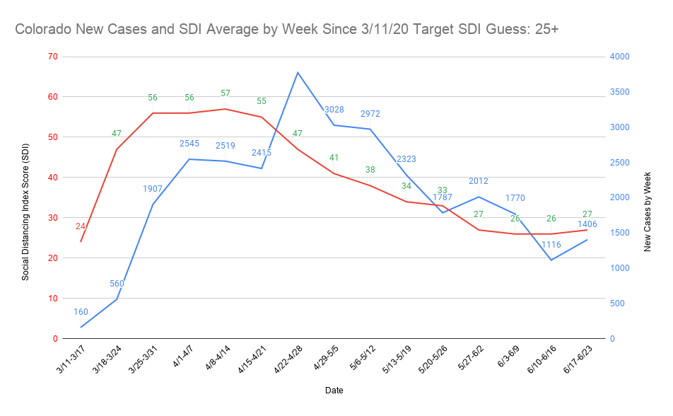
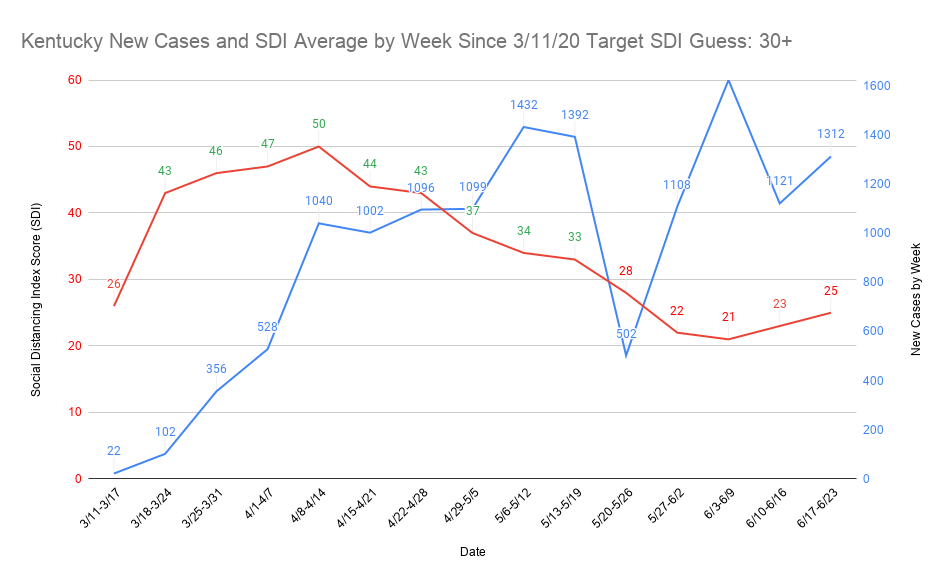
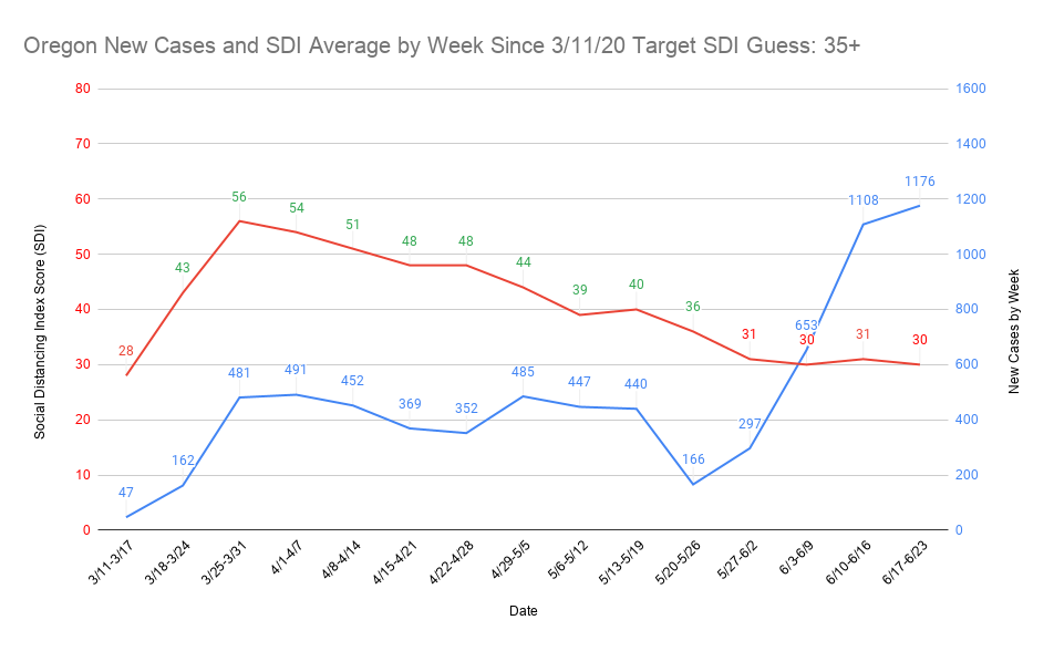
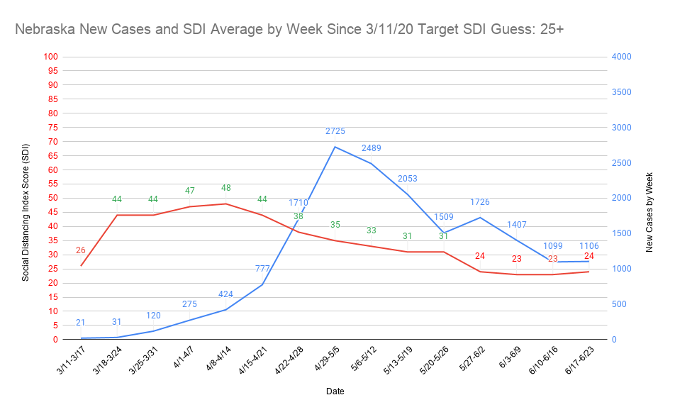
This article is a great example of why this thread is literally a better source of information than official government outlets like the WHO or CDC - politics.

The next morning, Dr. Clemens-Martin Wendtner made a startling announcement. Dr. Wendtner was overseeing treatment of Munich’s Covid-19 patients — there were eight now — and had taken swabs from each.

He discovered the virus in the nose and throat at much higher levels, and far earlier, than had been observed in SARS patients. That meant it probably could spread before people knew they were sick.

But the Science story drowned that news out. If Dr. Rothe’s paper had implied that governments might need to do more against Covid-19, the pushback from the Robert Koch Institute was an implicit defense of the conventional thinking.

Sweden’s public health agency declared that Dr. Rothe’s report had contained major errors. The agency’s website said, unequivocally, that “there is no evidence that people are infectious during the incubation period” — an assertion that would remain online in some form for months.

French health officials, too, left no room for debate: “A person is contagious only when symptoms appear,” a government flyer read. “No symptoms = no risk of being contagious.”

As Dr. Rothe and Dr. Hoelscher reeled from the criticism, Japanese doctors were preparing to board the Diamond Princess cruise ship. A former passenger had tested positive for coronavirus.

Yet on the ship, parties continued. The infected passenger had been off the ship for days, after all. And he hadn’t reported symptoms while onboard.

We all read the German guy who discovered so much shedding from the throat, and KNEW it meant patients could spread asymptomatically from their throat. No one really questioned it. Yet it took the official govt agencies 1-2 months later to officially recognize asymptomatic spread. Crazy.

3 Likes

I’ve finished my graphing project for the Social Distancing Index score (SDI) in relation to new case rise. In nearly all cases, it tracks with what I expected to see. Doing this using the weekly average SDI and the weekly new cases seems to have been the key to being able to visualize it properly. I consistently found the new case rise comes 2 weeks after the place falls below what I perceive to be the target SDI weekly average. There are a couple of reasons why I think this is the case, though I ultimately think it’s the latter of the two reasons. The first is the max 14 day expected incubation period. You shouldn’t start seeing rise with certainty until that period has concluded. The one I think is more accurate is that most people don’t show up with symptoms until what I believe is a 5.1 day mean average now. That means they’re unlikely to get a test until they show symptoms, the test takes a few days to process, and boom they’re a new case at the end of the 14 day window.

The biggest differences between March and now are mask wearing and lack of a starting point in new cases back then. Mask compliance is much higher but active cases are also at a much higher point nearly everywhere than they were in March. The country as a whole still has a better SDI score than 3/11-3/17, but it’s not far off. The problem is in March the country went into lockdown in many places with only one week of a bad SDI score when new cases began to rise. Now, many places are 4 or 5 weeks below (or more) their perceived SDI target score. It doesn’t take much effort to realize this means pushing the cases back down is going to require many more weeks above the SDI target score than it took at the beginning of the pandemic. I am beyond not optimistic that numerous places have passed or are about to pass their point of no return in controlling cases again prior to a vaccine. I think you’ll be able to clearly see the places I’m talking about on the graphs.

Even though I haven’t done full analysis of this guess, I think a place keeping its SDI 20+ points above the target provided a bending the curve effect within 4 weeks in most places at the beginning of the pandemic. 15 points keeps that trend going, and anything below 10 above means it’s likely only going to flatten. I think staying below 10 above the SDI target ultimately causes a sharp bounce back once the place has fallen below the SDI target score. For places that are riding the edge of their target SDI score, it likely means they won’t have a sharp rise or lowering. In places that fall to near 10 points below their target SDI, I believe they will have a major nearly uncontrollable spike in cases. For places that performed well, it takes much longer to see a case rise and the effect isn’t seen in case rise but rather a slowing in the case fall. My guess is that once it hits a certain point, it will begin to rise but that could take weeks in some of the best performing places. As always, these are what I consider to be educated guesses and if anyone sees any kind of confirmation bias in my assumptions please help me fix them.

There are 71 graphs I’m putting into two separate drop down spoilers so that it doesn’t clog up the thread. I’d be glad to do the county level SDI vs. new cases graphs for any county anyone requests. As I said, I’m fairly confident the pattern repeats over and over in nearly every graph (ones it doesn’t might be related to data release issues).

U.S./State/District of Columbia SDI Score vs. New Cases Graphs x 52

County Level SDI Score vs. New Cases Graphs x 19

7 Likes

Even without COVID that looks really fucking dangerous. I’m surprised people aren’t effectively trampled and drown.

1 Like

Nanodaughter and I are going camping Tuesday/Wednesday. There are a lot of places to camp within an hour or two and intend to start doing it somewhat on the regular.

5 Likes

Your pony got eaten by lil Sebastian.

7 Likes

Did u have internet access?

No phone service at all. It was a nice break.

2 Likes

Speak for yourself.

1 Like

Not sure if this has been posted but…uhh…seems like pretty strong data.

1 Like

A lack of restaurant attendance correlates extremely well with lockdowns being in place, so we can’t tell from this data whether the restaurants themselves are the culprit, or whether it’s related to lockdowns more generally.