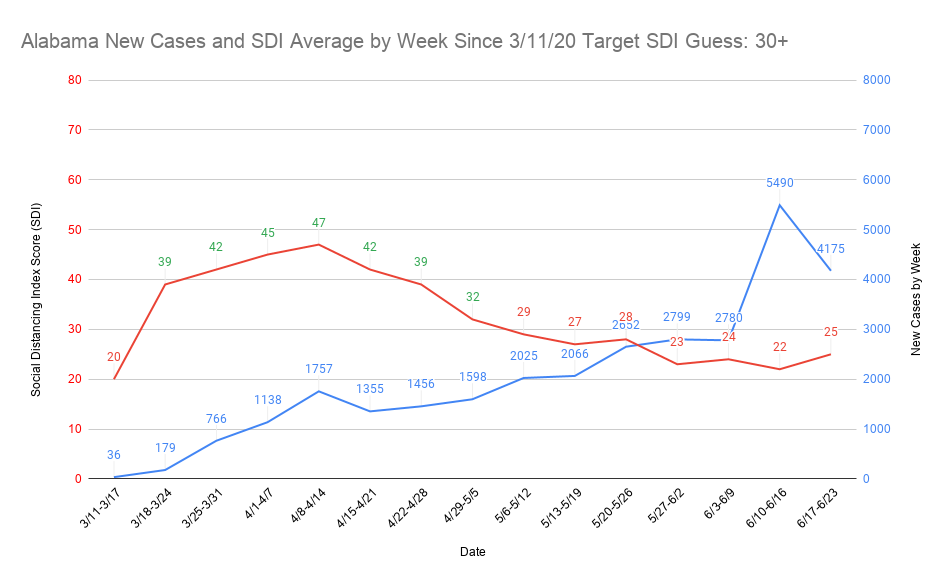
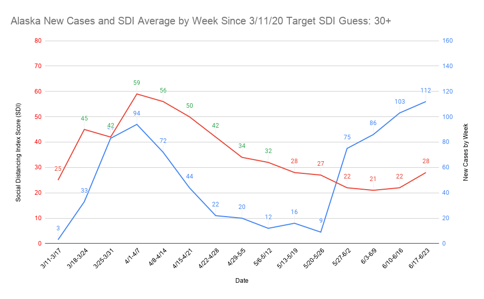
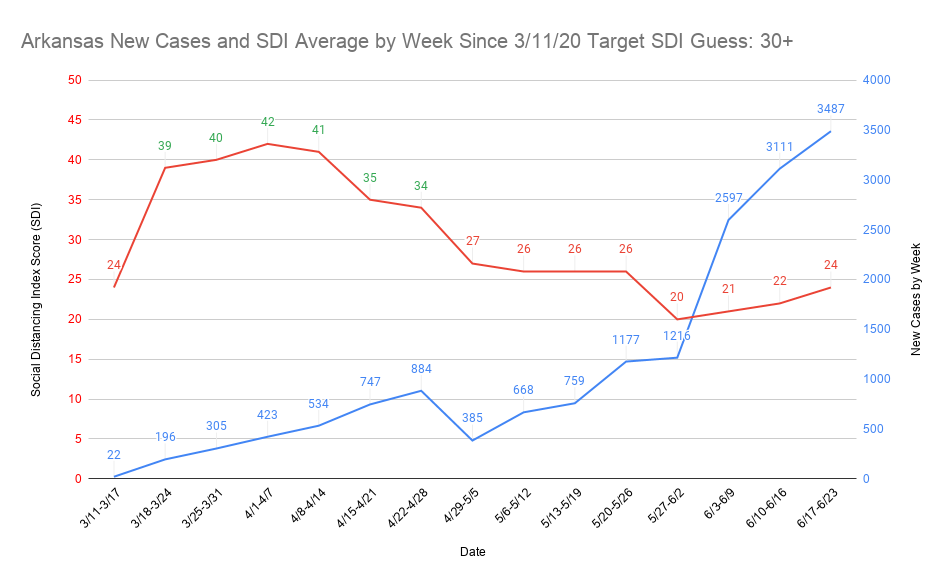
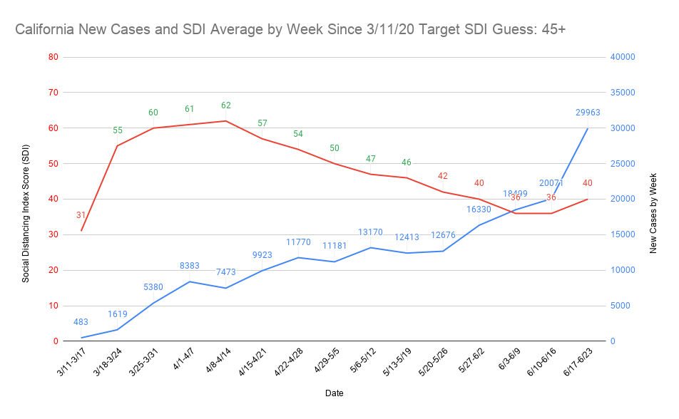
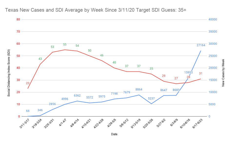
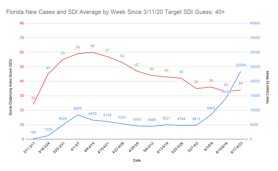
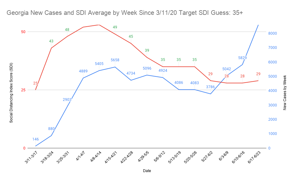
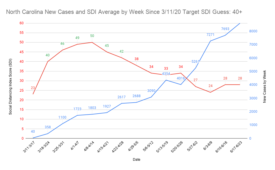
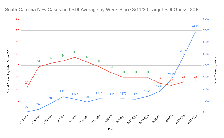
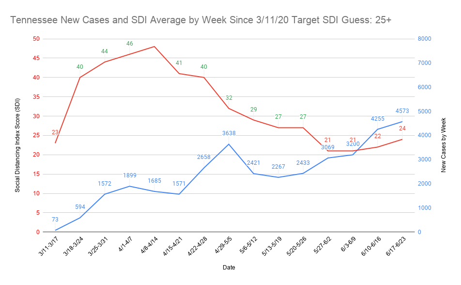
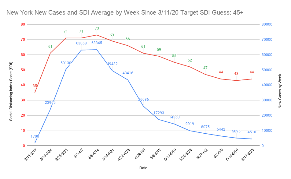
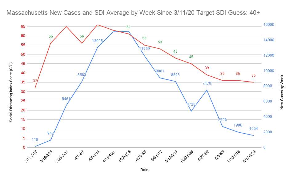
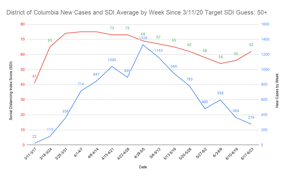
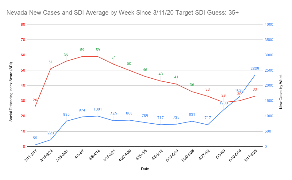
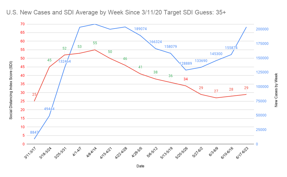
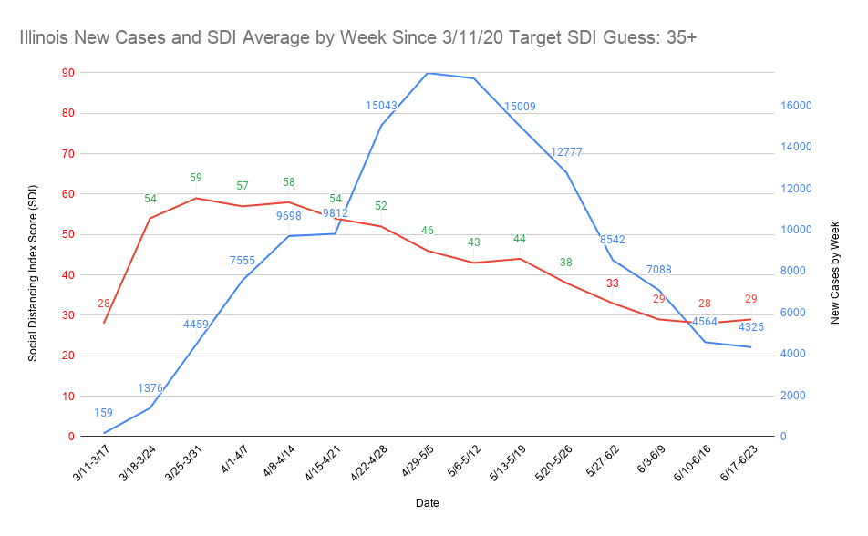
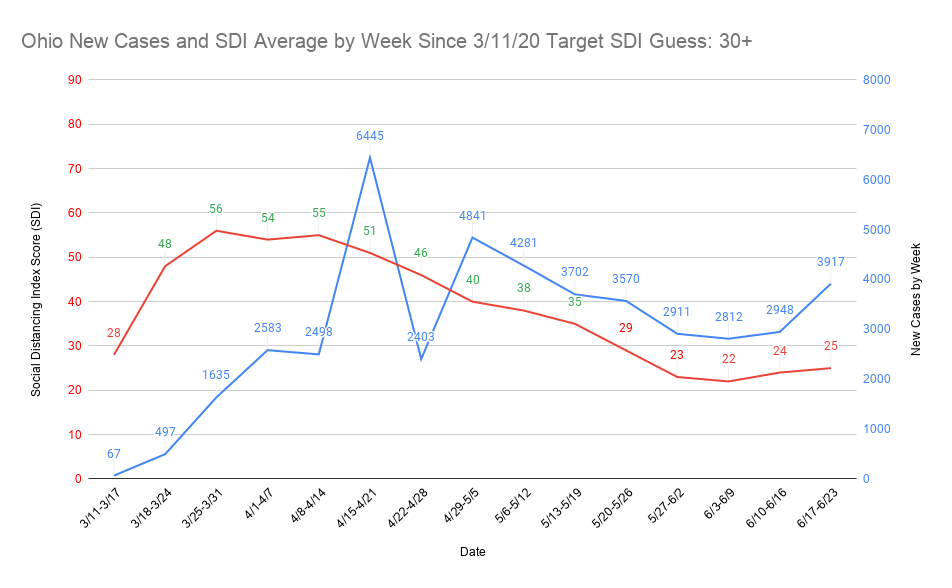
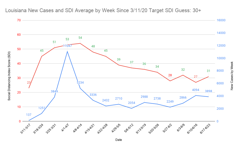
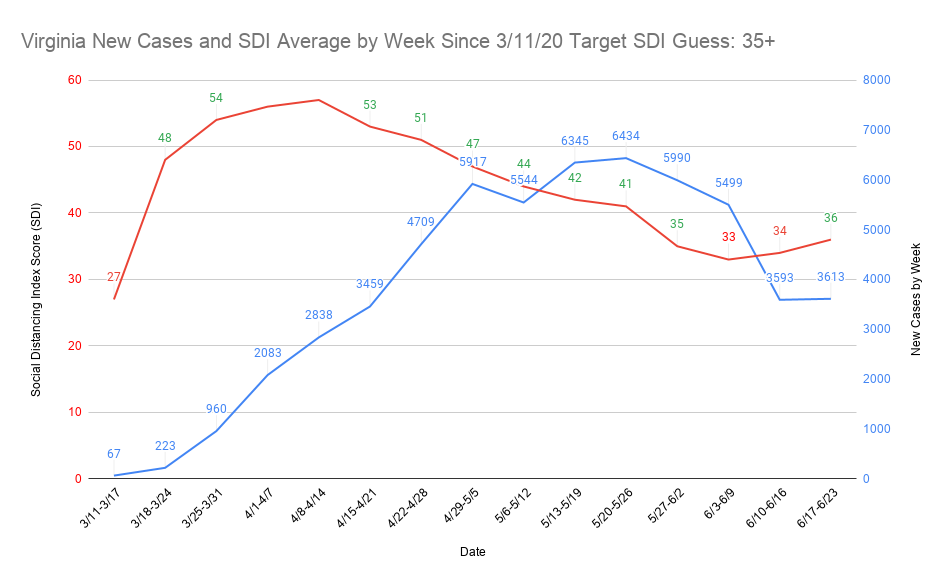
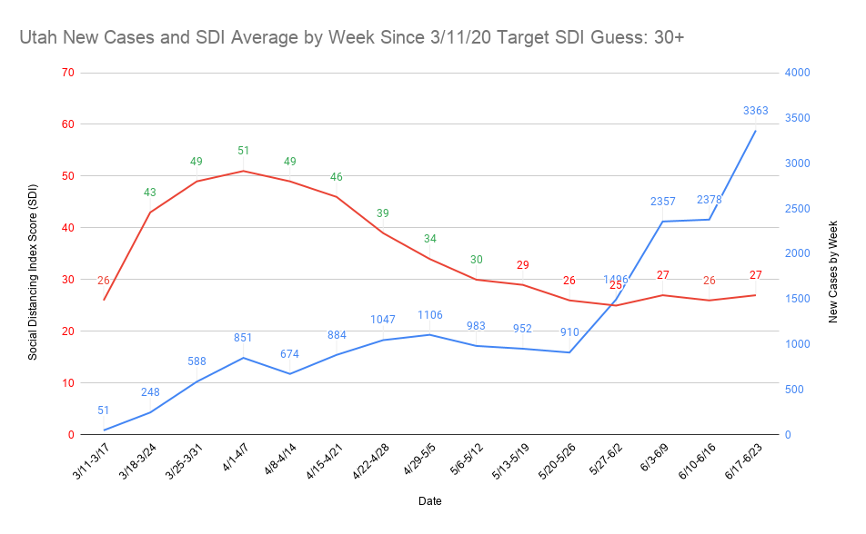
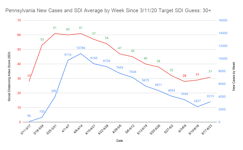
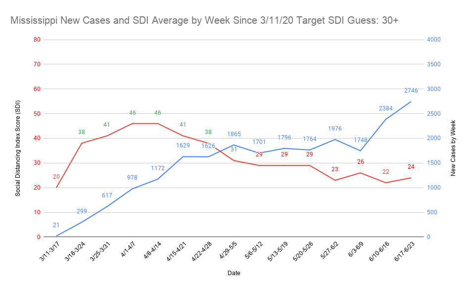
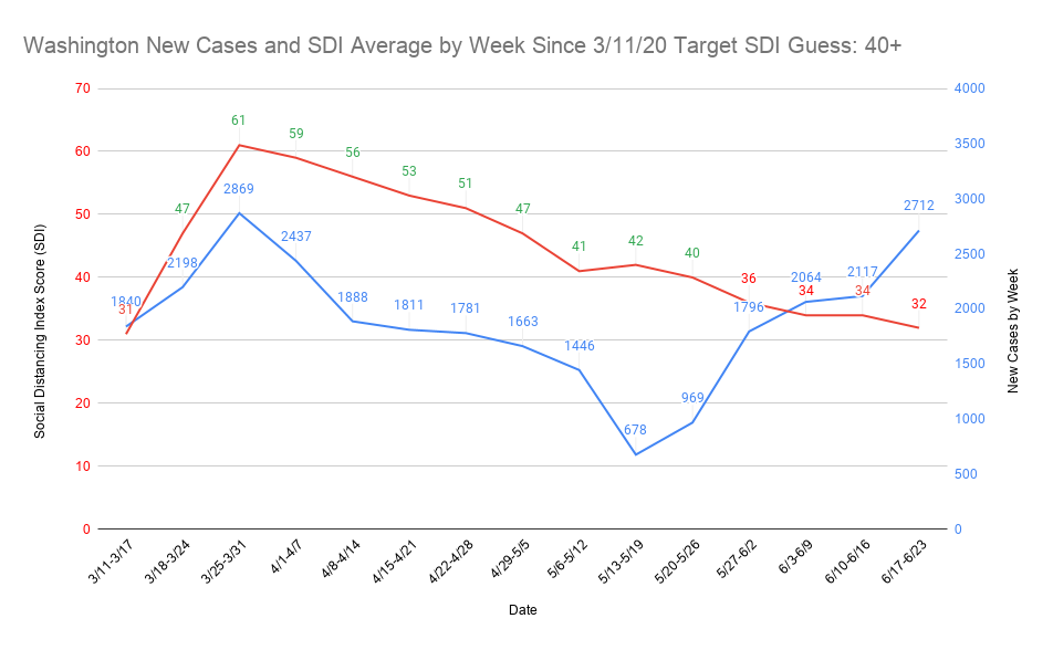
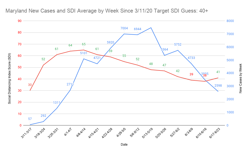
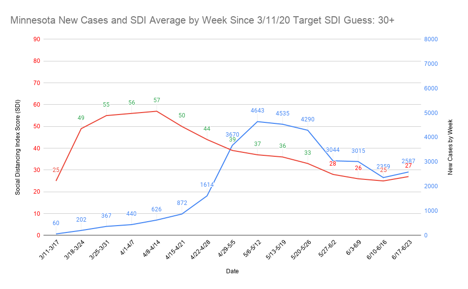
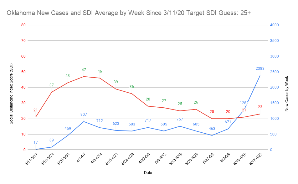
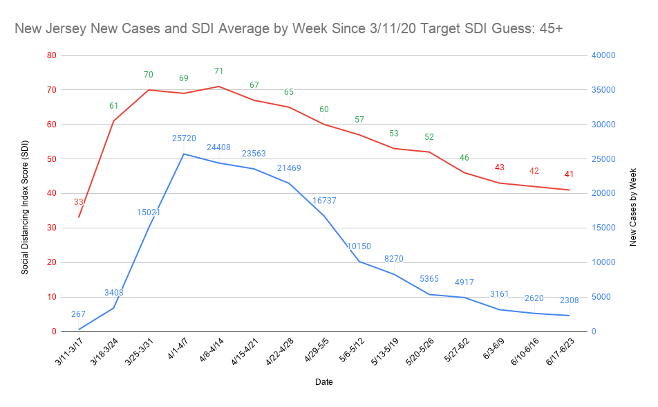
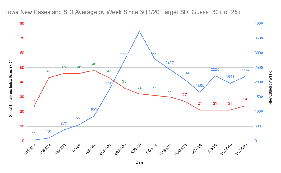
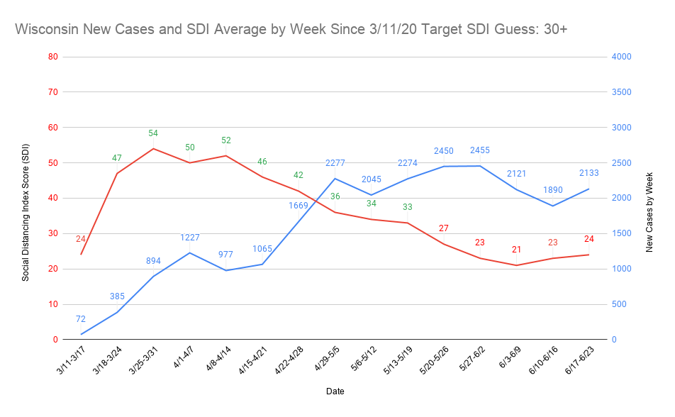
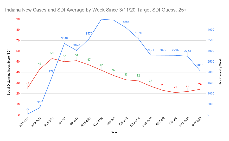
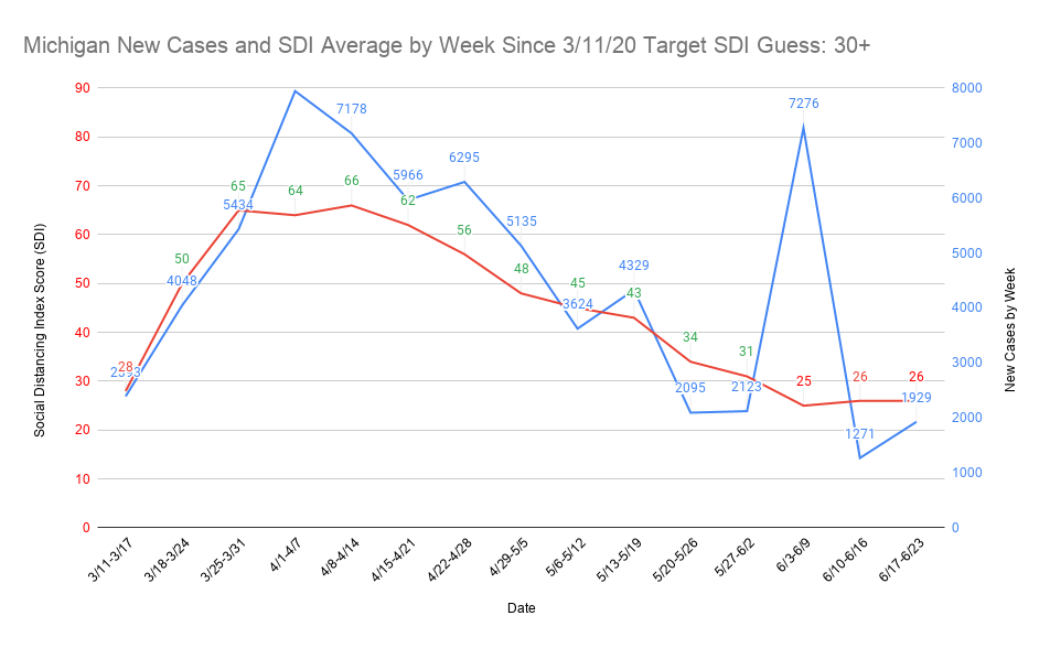
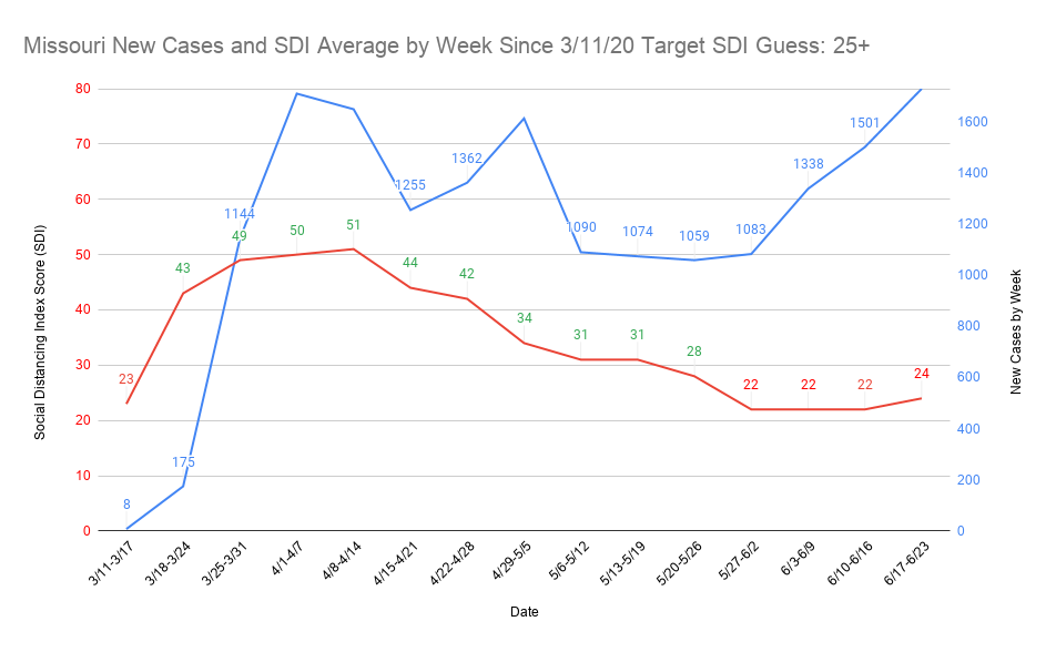
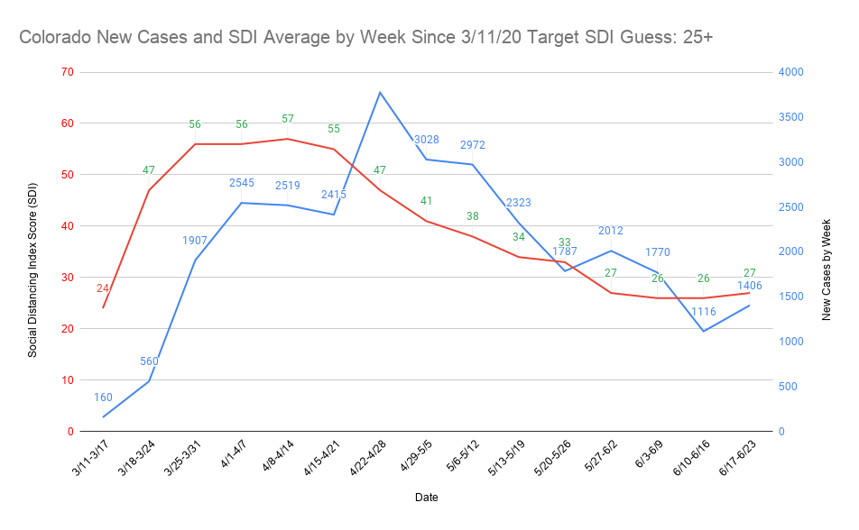
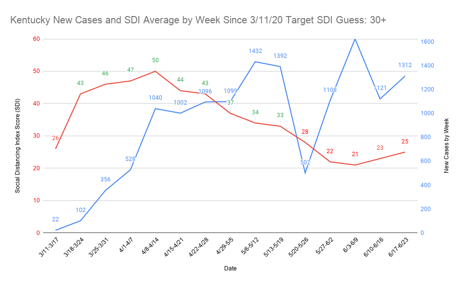
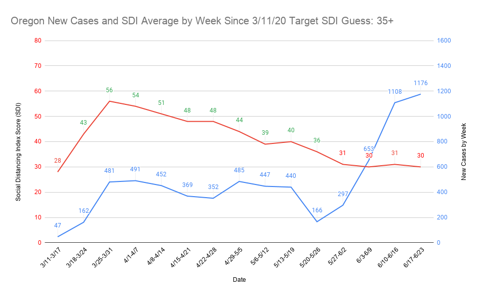
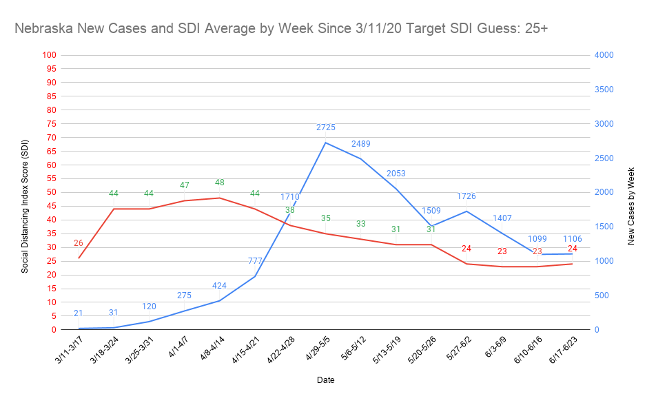
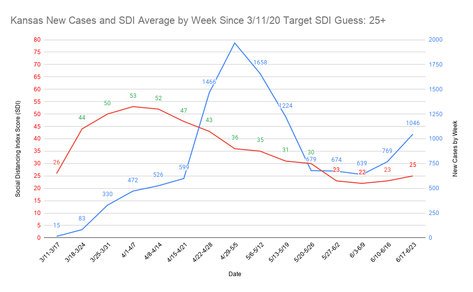
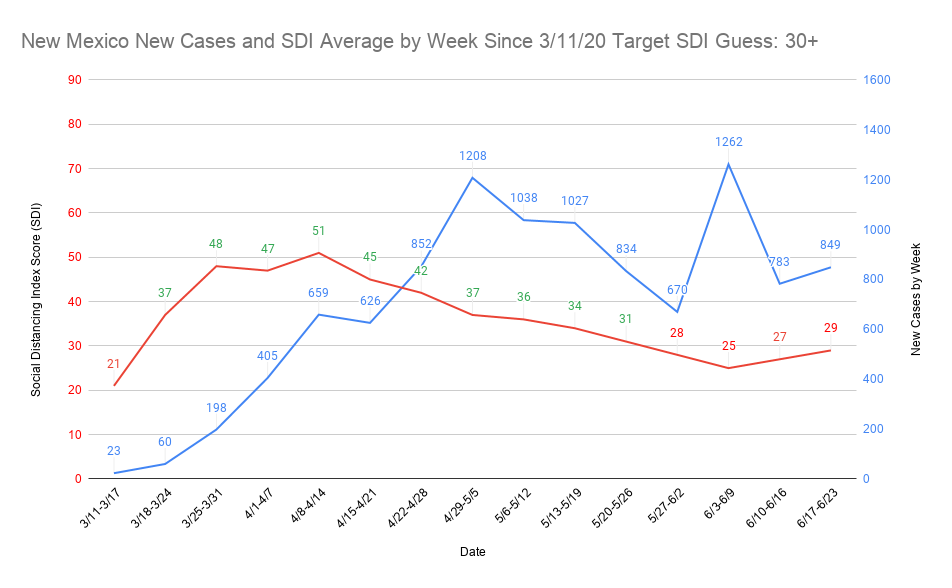
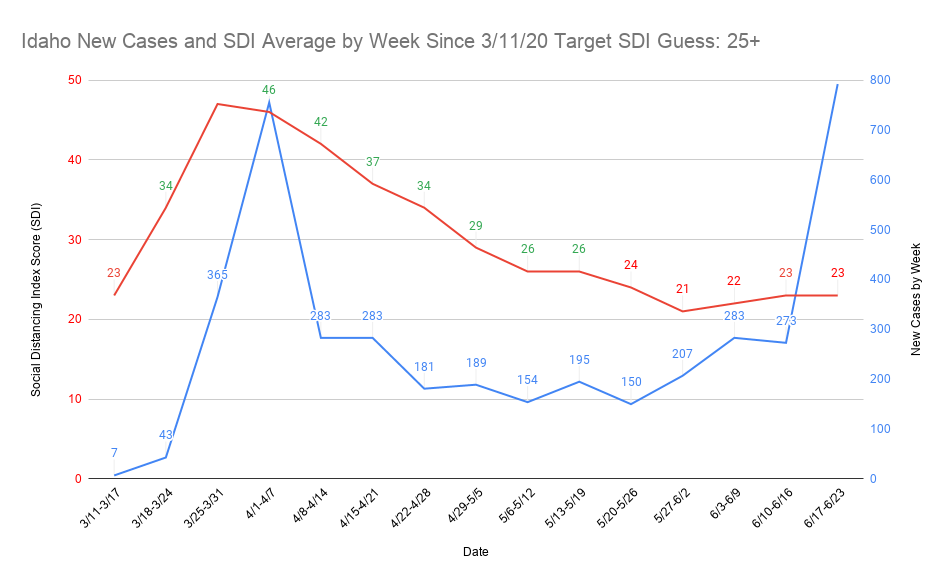
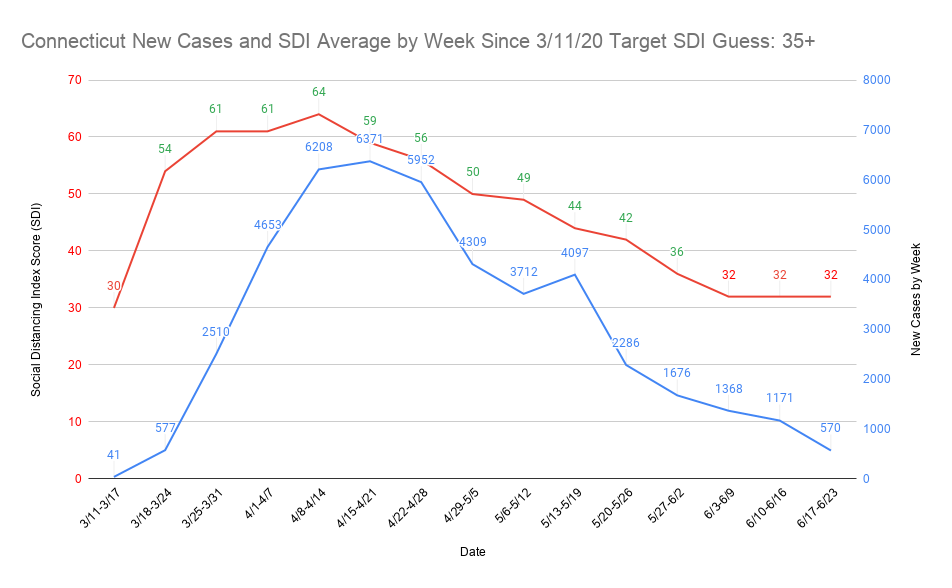
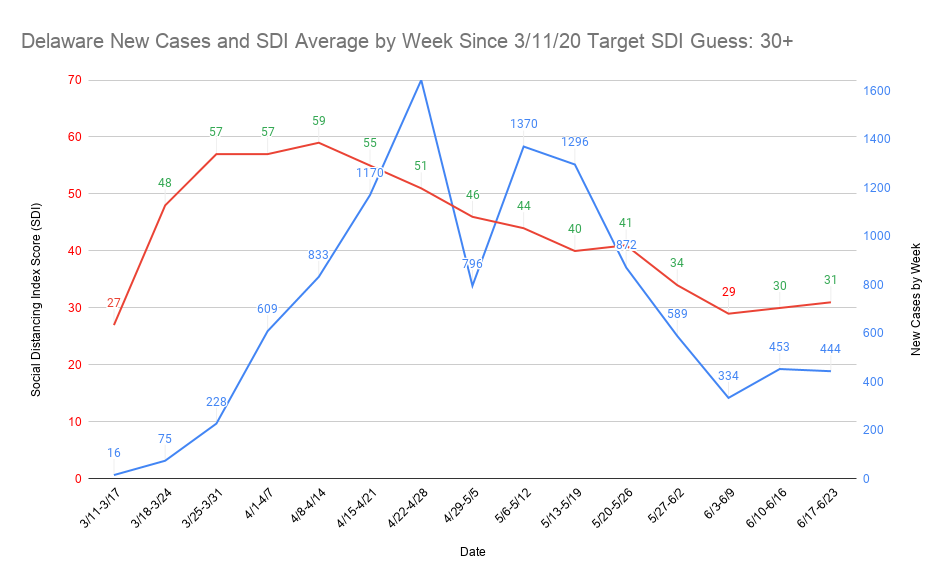
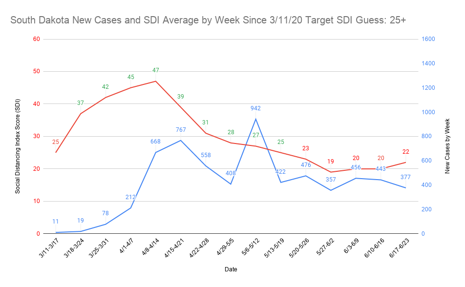
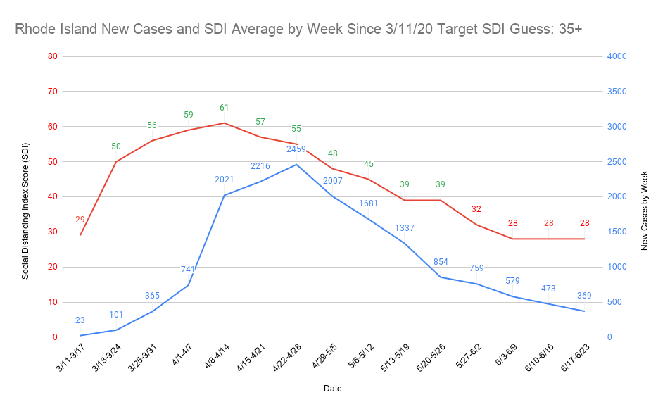
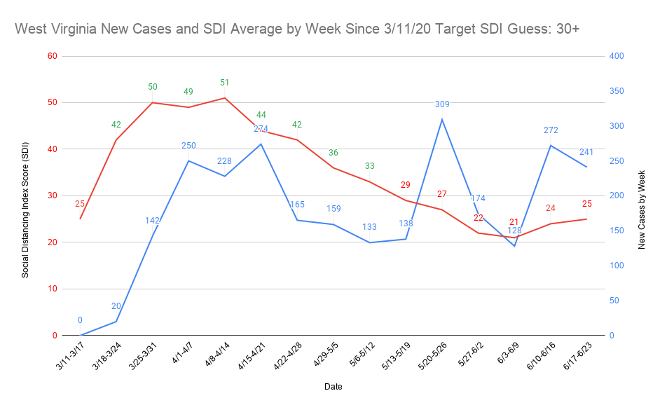
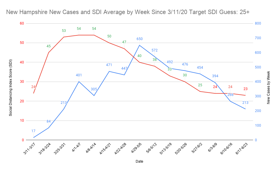
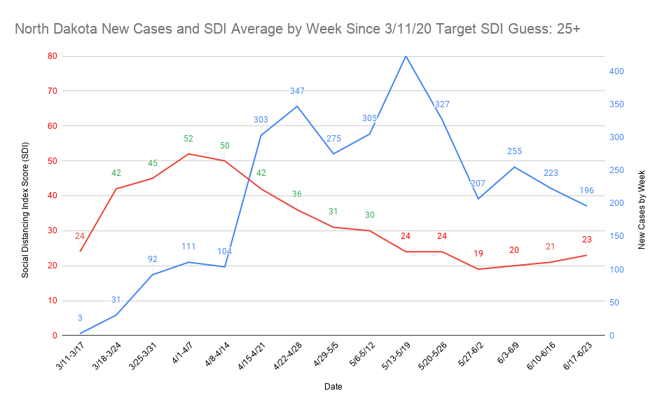
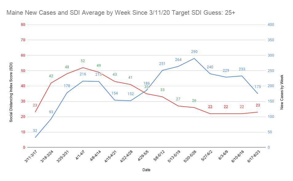
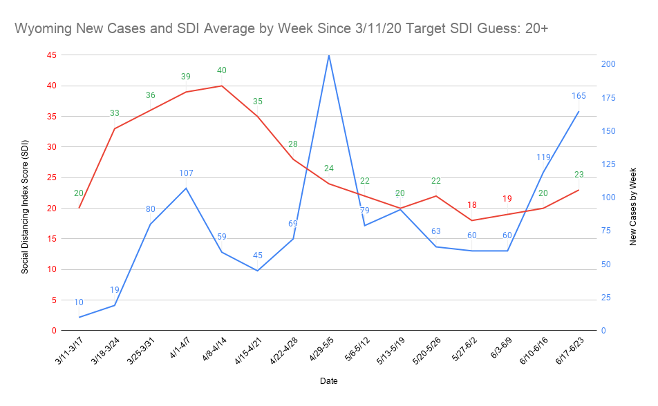
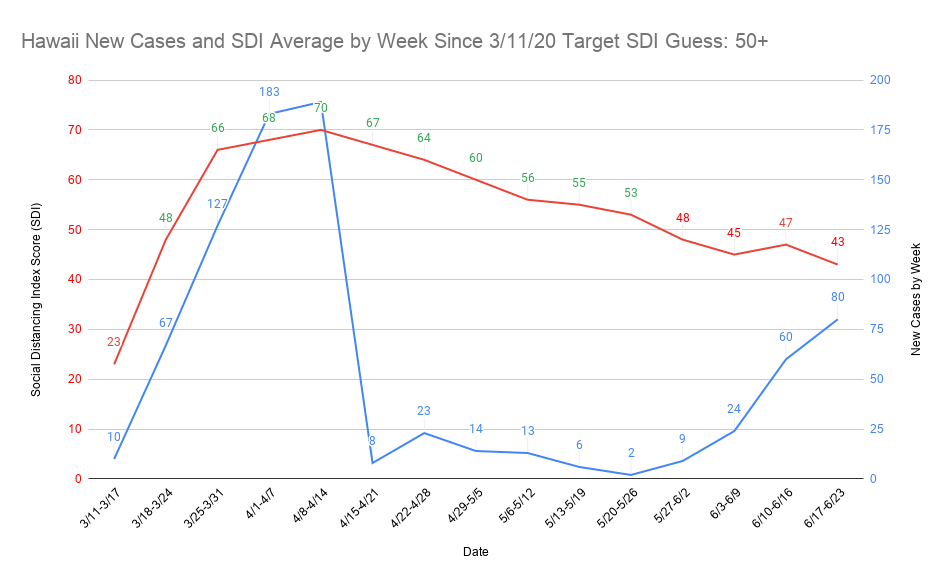
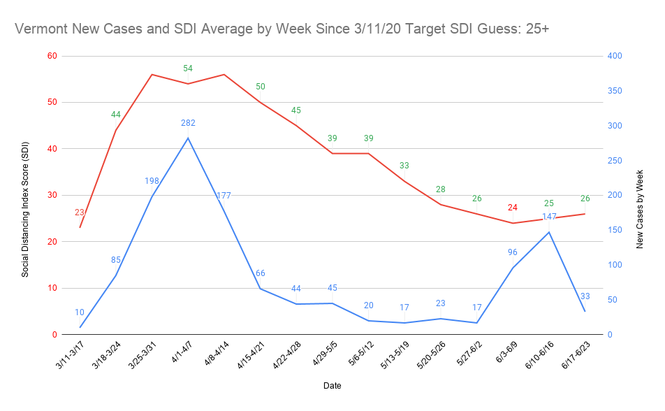
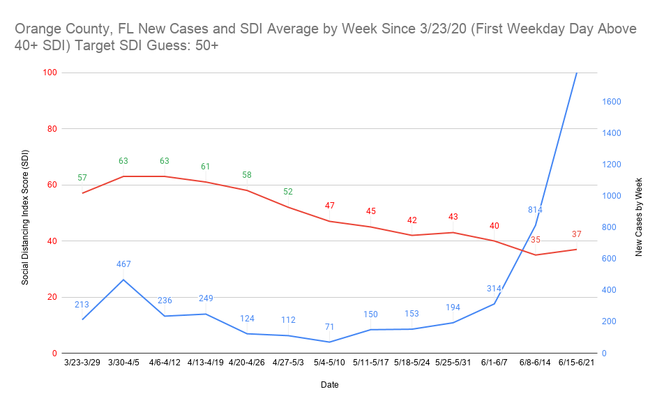
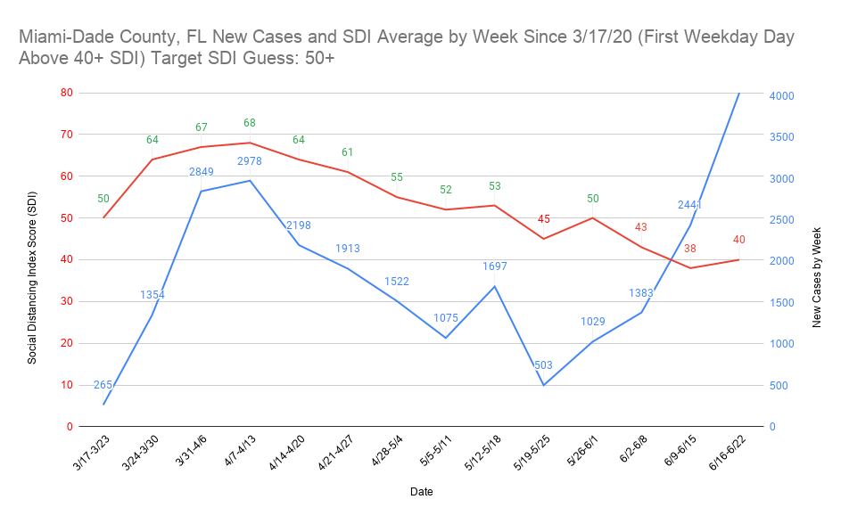
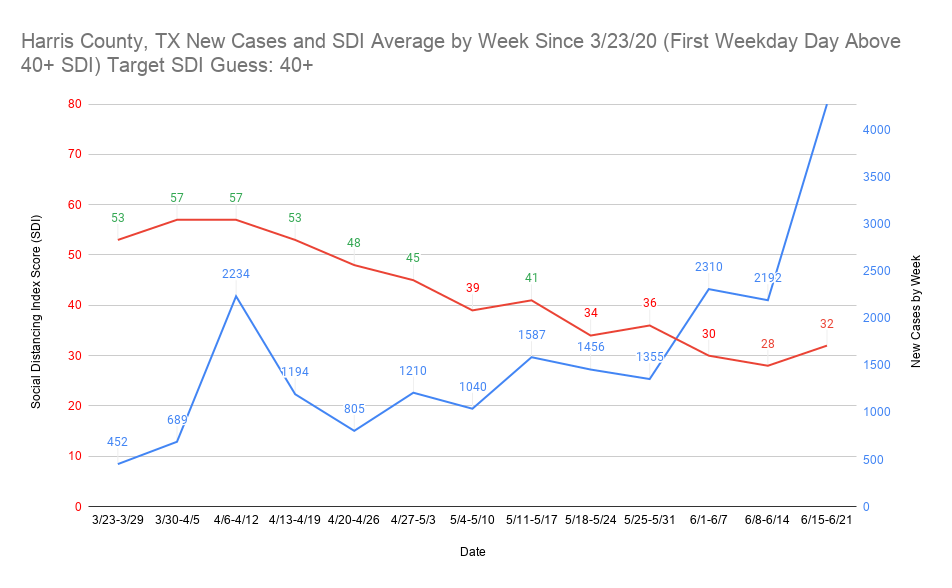
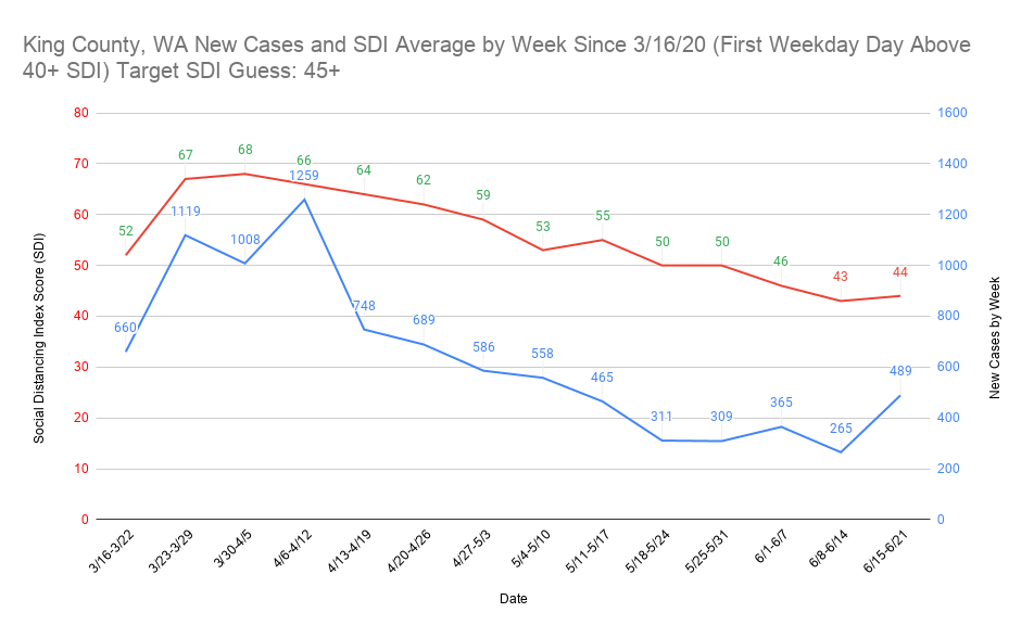
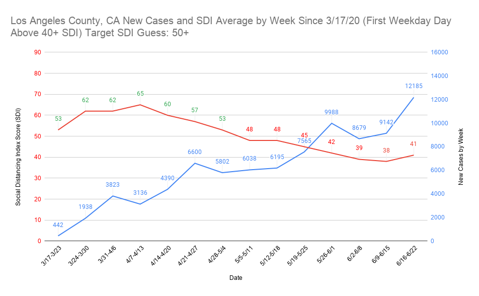
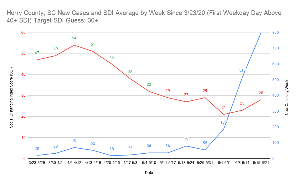
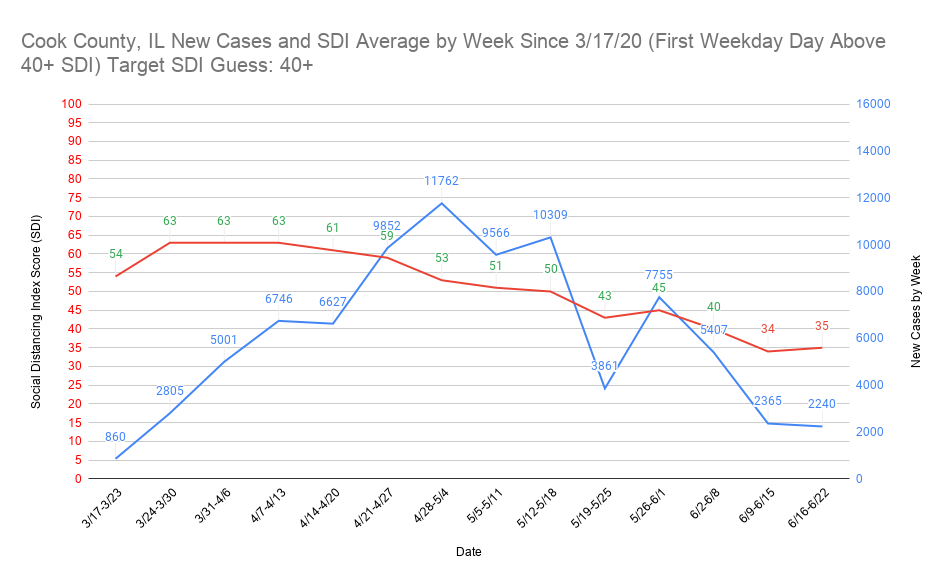
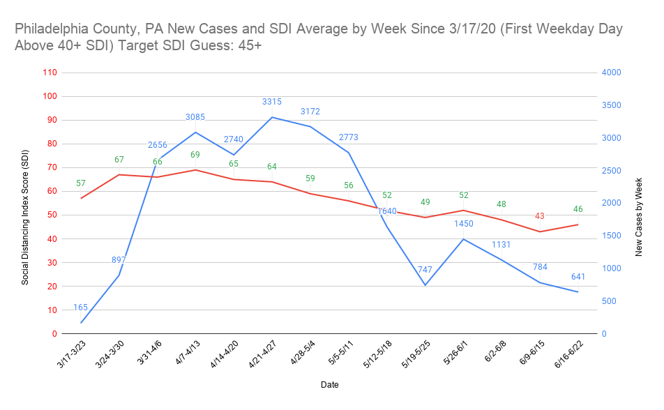
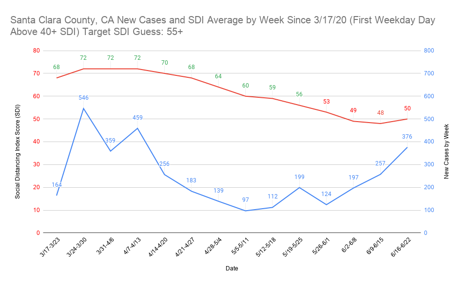
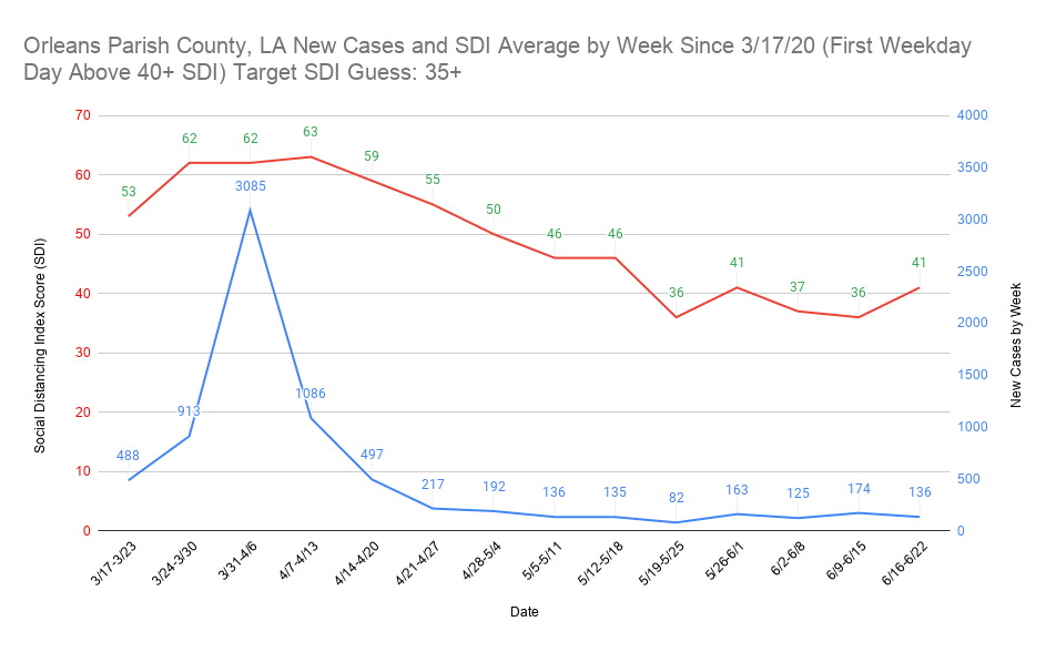
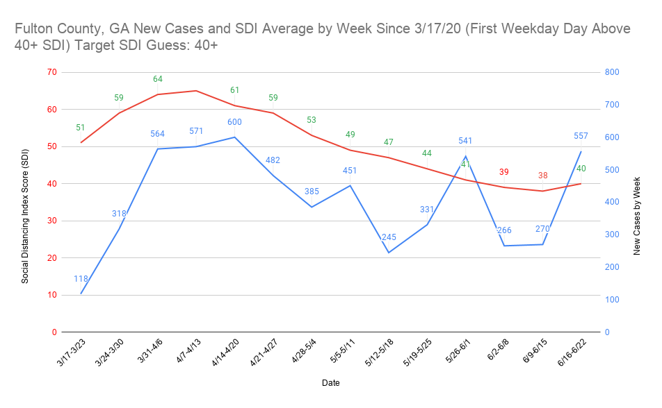
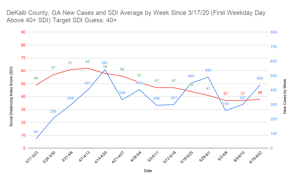
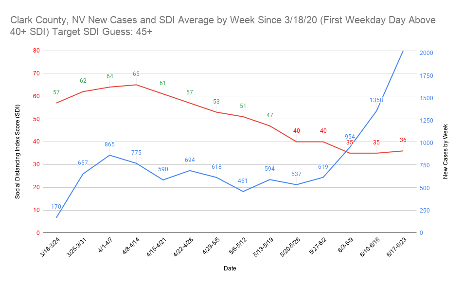
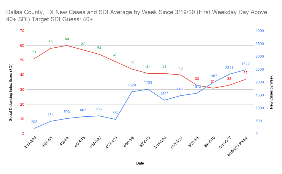
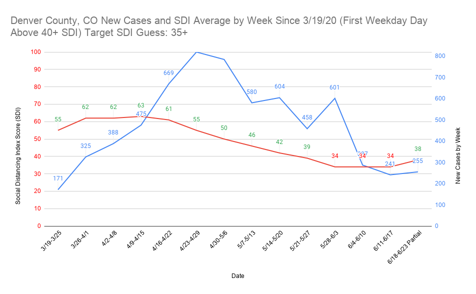
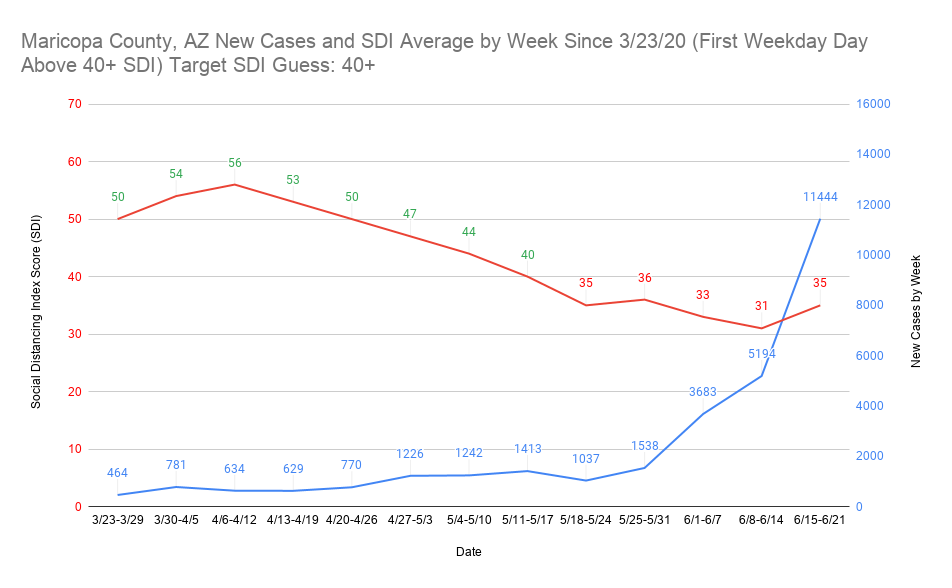
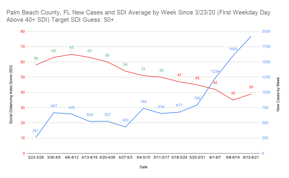
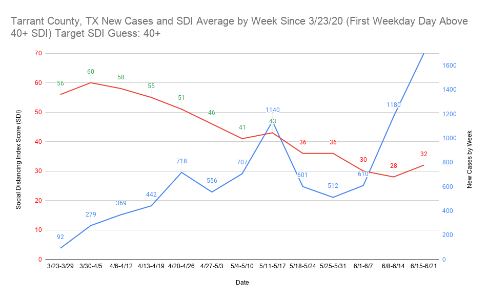
I’ve finished my graphing project for the Social Distancing Index score (SDI) in relation to new case rise. In nearly all cases, it tracks with what I expected to see. Doing this using the weekly average SDI and the weekly new cases seems to have been the key to being able to visualize it properly. I consistently found the new case rise comes 2 weeks after the place falls below what I perceive to be the target SDI weekly average. There are a couple of reasons why I think this is the case, though I ultimately think it’s the latter of the two reasons. The first is the max 14 day expected incubation period. You shouldn’t start seeing rise with certainty until that period has concluded. The one I think is more accurate is that most people don’t show up with symptoms until what I believe is a 5.1 day mean average now. That means they’re unlikely to get a test until they show symptoms, the test takes a few days to process, and boom they’re a new case at the end of the 14 day window.
The biggest differences between March and now are mask wearing and lack of a starting point in new cases back then. Mask compliance is much higher but active cases are also at a much higher point nearly everywhere than they were in March. The country as a whole still has a better SDI score than 3/11-3/17, but it’s not far off. The problem is in March the country went into lockdown in many places with only one week of a bad SDI score when new cases began to rise. Now, many places are 4 or 5 weeks below (or more) their perceived SDI target score. It doesn’t take much effort to realize this means pushing the cases back down is going to require many more weeks above the SDI target score than it took at the beginning of the pandemic. I am beyond not optimistic that numerous places have passed or are about to pass their point of no return in controlling cases again prior to a vaccine. I think you’ll be able to clearly see the places I’m talking about on the graphs.
Even though I haven’t done full analysis of this guess, I think a place keeping its SDI 20+ points above the target provided a bending the curve effect within 4 weeks in most places at the beginning of the pandemic. 15 points keeps that trend going, and anything below 10 above means it’s likely only going to flatten. I think staying below 10 above the SDI target ultimately causes a sharp bounce back once the place has fallen below the SDI target score. For places that are riding the edge of their target SDI score, it likely means they won’t have a sharp rise or lowering. In places that fall to near 10 points below their target SDI, I believe they will have a major nearly uncontrollable spike in cases. For places that performed well, it takes much longer to see a case rise and the effect isn’t seen in case rise but rather a slowing in the case fall. My guess is that once it hits a certain point, it will begin to rise but that could take weeks in some of the best performing places. As always, these are what I consider to be educated guesses and if anyone sees any kind of confirmation bias in my assumptions please help me fix them.
There are 71 graphs I’m putting into two separate drop down spoilers so that it doesn’t clog up the thread. I’d be glad to do the county level SDI vs. new cases graphs for any county anyone requests. As I said, I’m fairly confident the pattern repeats over and over in nearly every graph (ones it doesn’t might be related to data release issues).