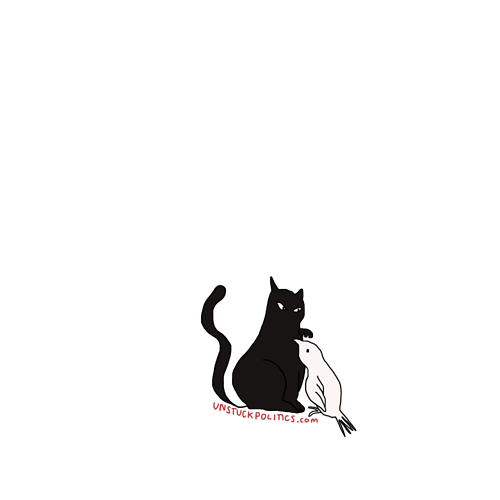
Sounds like a good idea. Could be in the art or a stripe below in a normal font that has “unstuckpolitics.com”.
I’m in for one regardless of final design. Here’s one idea:
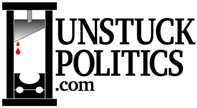
I suppose there might be some pushback from the community if we literally try to brand the site with a guillotine, but what the hell, I’m an edgelord.
Ok, I’ve put in a request for some more radical designs.
I’d get one.
I own a guillotine shirt…
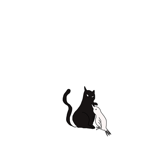
I’d likely buy one, but I’ll wait to see some additional designs. The dove designs were my favorite, but I’d be in for some more radical designs
Yeah I also like the dove, not sure how I feel about stealing the Schoolhouse Rock font though.
I like this design - does the first one say unstuck on it anywhere?
No. It should maybe be put in text right below. Also nothing should say up.com as that is someone else’s site. Also, I think the bird’s beak should be more like a doves.
I’d commit to one if you had them printed
I have a slogan suggestion:
Unstuck Politics: We are good posters. You will like us very much.
Unstuck politics - sanity in an insane world
I’m in though for whatever.
Feel like the URL needs to be more prominent and it should say something about what we’re even all about.
I’d wear one with just the logo on front
What’s the Twitter tag line again? Something about “more characters than Twitter… something something it’s sucks to argue with family”?
I don’t like clothes that indicate really anything about me, so a little vague is good for me. But getting to at least 24 orders is required so, I’m thinking something that gets at least 10 orders that are happy with it in this thread before spamming the LC thread.
I’d get one as is.
More characters than Twitter, fewer relatives than Facebook.


