Inflation slowing down also doesn’t mean the previous inflation did not happen.
Cool grocery inflation cooled off big time but shit is still more expensive.
Inflation slowing down also doesn’t mean the previous inflation did not happen.
Cool grocery inflation cooled off big time but shit is still more expensive.
Sure, things get more expensive all the time! Deflation is really bad! Good thing wages are still up when you account for that.
Really the scariest thing to me is that if you’re going to say the healthiest major economy in the damn world is bad because inflation went up despite not outpacing wages, with those wage increases centered in the lower earners, nothing is ever going to work for you.
Yeah, this isn’t a problem that is just NYC and California.
I realize this is anecdotal, but someone where I work bought a house, sold it in the late 2010s to go take care of family, and now can no longer afford that same house, despite having the same job the entire time.
Reading is tough Ike’s, it’s ok. Comprehending what people say is even tougher.
Thanks for the entertainment mr. Ike’s
That’s why they call him IIIIkes, he’s back, he’s back.
Depends how you conceptualize the economy, lot of people would probably choose an “economy” with worse “economic numbers” but universal healthcare and childcare,
Maybe, but given that a majority of people say donald trump is better on the economy it sure as shit isn’t close to a majority.
![]()
Thank you Ike’s, you have played your part
Anyone who’s interested in this stuff should probably check out Arin Dube and Jeremy Horpedahl, economists who have thought about this question pretty deeply, and written very clearly about it. Two good recent posts:
Wage growth, inflation, and inequality - by Arin Dube (substack.com)
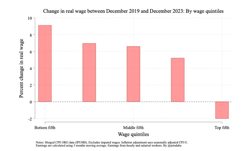
If you’re going to pick one, pick the second. The one point raised in that post that’s been ignored in this thread is this one: the composition of those quintiles changes over time, which can change the interpretation of these charts quite a bit. Take this one:
The interpretation has been that people in the lowest quintile have had the highest wage growth, but that’s not quite right. Specifically, it doesn’t mean that the people who started in the lowest quintile had the largest wage growth, while the people who started in the highest quintile had the lowest (actually negative) growth. That’s because people change quintiles over time. Maybe the easiest way to visualize this is to think of an individual who joins the workforce and is unsurprisingly in the bottom quintile income, then over the course of his career graduates to the highest quintile for several years, followed by his retirement which bounces him back to the lowest quintile. That individual is going to experience higher wage growth than someone who stays in the bottom quintile of earnings, but that individual’s wage growth won’t be evident in the above graph.
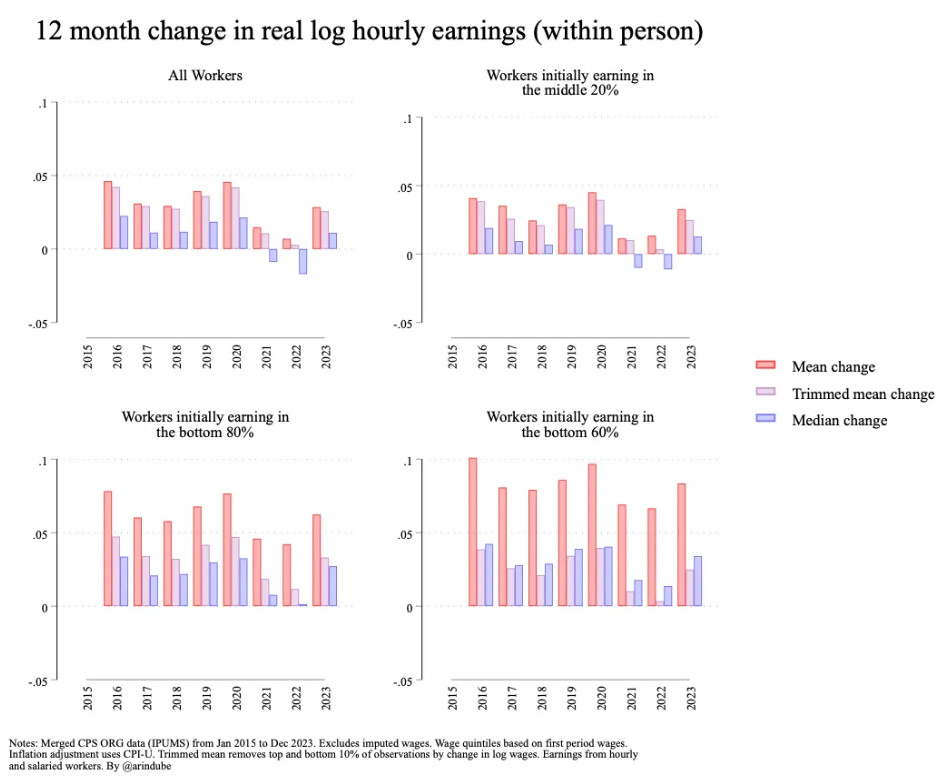
So if you’re concerned about the lowest income individuals and their outcomes, you want to track their wage growth over time regardless of which quintile they end up in each period. Dube does that here:
What you see is that, when you combine two effects:
you get a better sense for the experience of the average/median worker. So from a policy perspective, you probably want to focus on two things, not one:
I think both of those, not just the first question, are important to people.
Anyway, this stuff is fascinating to me, and there are endless ways to analyze it.
Does this type of analysis try to account for how people at different income levels experience inflation differently with respect to calcualting “real wages”? For example, someone in the highest quintile may be more sensitive to airline fares, and someone in the lowest quintile may be more sensitive to groceries.
I can’t tell if you’re serious or trying to turn this conversation into a Mobius strip that will perpetually return to the idea that different individuals experience different levels of inflation. But if you’re serious, it does not take that into account. Unless you see a phrase that looks something like “experimental CPI”, you’re not looking at income-adjusted inflation rates.
In the version of this thread on the other forum, no one is allowed to talk about CPI because it has been totally discredited as a valid metric by the thread captains because it does not properly accounting for how sensitive poor people are to housing costs. I guess I assumed it was theoretically possible to create some modified CPI per income quintile using survey data. I don’t think people in the bottom quintile are buying a lot of airline tickets.
I feel like this is re-hashing a discussion that just happened here. The graph that @bobman0330 posted is exactly that - it’s change in real wages based on adjusted (“experimental”) CPI by income quintile:
That was followed by a lot of bickering, so I would understand if people quickly scrolled past it all.
This just in - upper class income individual’s opinion from someone that works as a doctor in an area that lacks doctors, with a relatively low cost of living compared to uneducated working-class individuals (mostly agricultural workers) doesn’t see cost of living as an issue people should complain about. why can’t we all just bootstrap like ikes and then move to the central valley? like duh? you simpletons.
Continuing this conversation that probably only I am interested in, there’s an interesting survey from the University of Michigan here:
https://data.sca.isr.umich.edu/fetchdoc.php?docid=75635
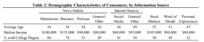
Rather than just showing overall consumer sentiment, it asks respondents where they primarily get their news, and then see whether the primary source influences their views. They get this:
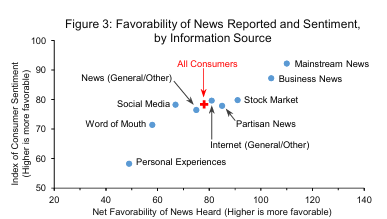
So basically, if you’re someone who primarily gets their news about the economy from mainstream news, you’re getting relatively favorable news reported to you, and you’re likely to have fairly positive sentiment. On the other hand, if your primary information source is personal experience, social media, or word of mouth, then you’re consuming relatively negative news and you have relatively negative consumer sentiment.
It’s a little difficult to tease out some kind of causal story here (do people who consume mainstream news have more positive sentiment because of that positive news? or do people who have positive sentiment seek out news that conforms to their beliefs?) This is harder because you have pretty different demographics across the groups.
I think there’s enough ambiguity here that no matter what your priors were, there’s something here to confirm them.
I was going to posit that there’s probably correlation between class and news sources, but it seems they thought of that and tried to look at it via income. I’m not surprised that higher-earning people consume more mainstream and business news. I assume they’re theorizing that news source is actually more correlated to economic sentiment than income? It’s not entirely clear but they do hint at the relationship here
Consumers relying on personal experiences as sources of economic information are least likely to have a college degree and
also have lower incomes relative to those citing most other sources. Recall that consumers citing personal experiences report
hearing strongly unfavorable news about the economy and have the lowest levels of sentiment (see Figure 3); their
demographic characteristics suggest that their views of the economy may be informed by having more vulnerable financial
circumstances.
Yeah, I hesitated to post it at all because I really don’t think there’s an obvious takeaway. But I still end up think it’s interesting (and supportive of my unstated priors).
Mainstream news is going to skew heavily liberal and therefore positive
That’s probably true now. Was that true during Trump? I can’t remember. I’m picturing a two button meme with a mainstream news economic editor choosing between “Trump Bad” and “my rich friends are doing just fine”
Right, I mean that the survey doesn’t shed much light on the question I’m interested in: Why does the average person have a significantly more negative view of the economy than the headline numbers would suggest?