Basically when a democrat becomes president republicans view the economy as negative 9-1 with essentially no variation among income levels.
Democrats will change based on president but by not nearly as much. They have varied by income level
Basically when a democrat becomes president republicans view the economy as negative 9-1 with essentially no variation among income levels.
Democrats will change based on president but by not nearly as much. They have varied by income level
I like this explanation (it’s an article and thread)
https://x.com/jburnmurdoch/status/1788916532271087703?s=46&t=N0_fcOKIYYmlCS2e4YShsQ
I’m just going to pretend that this thread is my blog.
New CBO report out: An Update About How Inflation Has Affected Households at Different Income Levels Since 2019
Interesting overall report that continues to look at income and inflation for people in different income groups. Headline points:
For households in every quintile, the share of income required to pay for that quintile’s consumption bundle decreased. In other words, if you held constant the goods/services that each quintile purchased in 2019, the growth in income for that quintile (through 2023) was greater than the increase in prices for those goods/services over the same period. More succinctly: the basket of goods/services has become more affordable for each quintile. (Of course this isn’t true for every single individual. These are averages.)
The top income quintile had the largest decline in the share of income required to pay for the 2019 basket of goods/services. (At first, I misunderstood this to mean that things were worst for the highest quintile group, because I’m accustomed to “decline” being a bad thing. But here, it means the highest quintile did best because their purchasing power increased the most.)
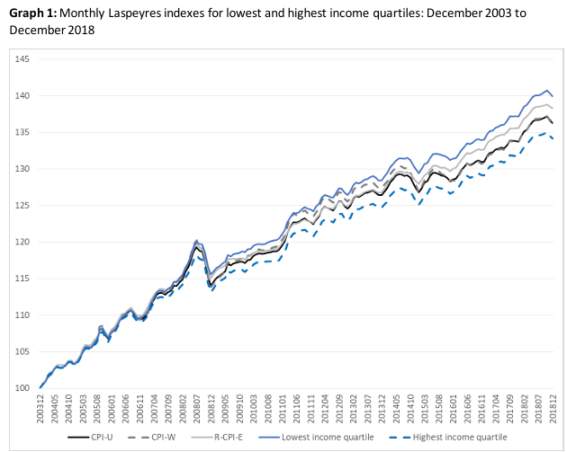
There’s a pretty striking variation across income groups. This is “the share of household income required to purchase a 2019 consumption bundle”:
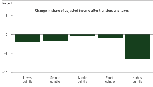
(This graph includes transfer and tax payments, but the same pattern is there if you only look at market income)
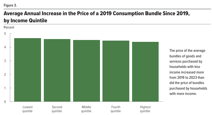
That variation is not driven by quintile-specific inflation rates. Inflation is pretty similar across the groups. Very slightly lower for the top quintile (4.4% versus 4.7% per year for the lowest group, which translates to 13.8% vs. 14.8% in total for the 3 year period), but I think the story of “overall inflation rate is biased and is much higher for those in the lowest economic class” isn’t supported by the data:
Maybe most interesting to me is that U-shaped pattern in the first graph. If you were in that middle-quintile group in 2019, it’s probably pretty frustrating to feel the “middle class squeeze” where people both richer and poorer than you seem to be experiencing more favorable trends.
Since 2019 is a very weird time period with a huge pandemic effing things up. It’d be more interesting to look at these things over a longer time period and then some huge disturbance in trends when COVID hit might be apparent and affect one’s understand significantly.
Agree. I’m personally interested in this particular period because I’m trying to understand the link between people’s perceptions–right now–about the economy vs. quantitative information about the economy. But I’d also be interested in seeing how this looks over a longer period.
Unfortunately, I think the inflation data, where they try to measure different rates for different income groups, is something they’ve only recently tried to calculate and provide to the public.
Edit: Procrastination is great; can’t wait to get fired. I found some additional data/studies.
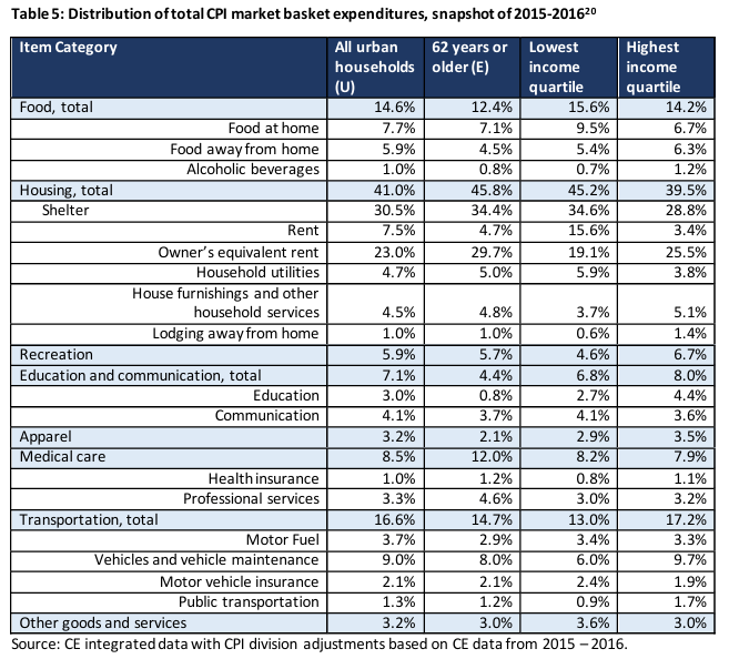
Here’s more information about how actual spending differs across deciles of total $ spending. So you can look at these allocations and get a sense for whether the lowest group is spending a disproportionate share on certain categories compared to other groups. You could also use this to create your own re-weighted inflation measures. You need to do a little rearranging of data, but you can see, for example that in 2017 (the earliest year):
– There was a total of $13.291 trillion in personal consumption expenditures ($4.2 trillion in goods, $9.1 trillion in services).
– Of that amount, the top decile represented $3.6 trillion (27.5%) of all purchases, while the bottom decile represented $461.5 billion (3.5%).
– In terms of disproportionate spending, the top decile spend much more on motor vehicles (49.4%) and recreational goods/vehicles (51.5%) than the lowest decile (0.3% and 1.4%). On the flip side, the lowest decile’s spending was relatively highest for food and beverages (6.4% vs. 17.5% for the top decile) and gasoline/energy (4.9% vs. 18.3% for the top decile).
– Another way to make the prior point is that it reflects the obvious point that necessities like off-premise food and beverages, gasoline, health care, and clothing have the flattest consumption patterns.
– Maybe surprisingly, housing and utilities has almost the same pattern as total purchases. The lowest decile makes up 3.9% of housing and utilities compared to 3.5% of overall spending. The highest decile makes up 28.4% of housing and utilities compared to 27.5% of overall spending.)
Here’s a summary of an old study looking at trends from 1983-2005:
We find that the inflation experiences of the different groups are highly correlated with and similar in magnitude to the inflation experiences of the overall urban population. Over the sample period, cumulative inflation for the groups ranged from 195% to 212% as compared to inflation for the overall population of 201%. The group with the largest deviation from overall inflation consists of households where the head or spouse is 65 years of age or older. These households had cumulative inflation 5%, or 11 percentage points, higher than the average.
Probably a more digestible presentation of consumption data across different levels of income:
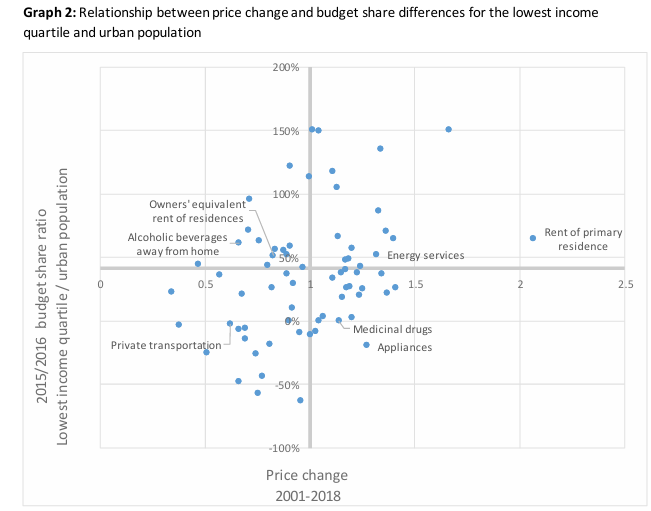
And what might be a one-stop graph that shows how different groups experienced different inflation rates, because it includes both the variation in consumption share for different goods/services as well as the inflation rate for those goods/services:
The way to interpret this graph is that items on the right experienced greater inflation than average, and items on the top are a greater share of consumption for low-income groups. So things in the upper right quadrant are the most relatively painful for the lowest-income group.
Thanks for posting this info Spider
Starting responding in the Biden thread, but feels more appropriate here.
You say this a lot. What evidence do you have that this is true?
For example, young people who voted for Biden overwhelmingly have a negative view on the economy. Why do you think that is because of “vibes” and “untethered to reality”?
I think the economy is good because the vast majority of traditional economic measures are good? Unemployment, gdp, real wages, etc are all great. What economic statistics are bad?
What’s even more striking when you poll people how they or their locality (neighborhood, state, etc) are doing it’s actually overwhelmingly good, but they think the nation is bad. People are influenced by our shitty media environment generally.
This is an older example, but there’s lots more:
Thirty-five percent of voters describe the state of the nation’s economy these days as either excellent (6 percent) or good (29 percent), while 65 percent describe it as either not so good (28 percent) or poor (37 percent).
Nearly half of voters (47 percent) think the nation’s economy is getting worse, 28 percent think it’s staying about the same, and 23 percent think it’s getting better.
A majority of voters (61 percent) describe their personal financial situation these days as either excellent (9 percent) or good (52 percent), while 38 percent describe it as either not so good (25 percent) or poor (13 percent).
Also please note that you can have the point of view some leftists have of ‘the economy isn’t fair and I want it to be better’ and that’s fair. I view that as different than ‘is the economy good’, because by that POV the American economy has never been good in history, and that’s not a valid standard.
Wealth inequality is the biggest one. Costs of essential things like housing.
I’ve seen that disconnect too, but I’m not going to attribute it to the media environment without evidence.
Real wage growth is highest is lowest income workers. Wealth inequality has always been there as well, it’s not new.
Is less than real wage growth.
What type of evidence would you like? There’s going to be no direct evidence. There’s poll after poll with the findings above from Michigan.
Wealth inequality is light years worse than 50-60 years ago. Your views are vast oversimplifications of reality to suit your worldview.
Has the USA increased wealth inequality lately? (It hasn’t btw)
The irony here is that this is you. How to measure wealth inequality is annoying complex, but the last gini index available is from 2021, and it’s at 1990 levels, a sharp drop. It’s probably a little better now, as real wages growth has been better at lower income levels. It might be set off by gains in stocks and etc, but it’s not super different than anything else over the past 25 years or so.
Again, you can find this level of inequality unacceptable, but then the usa has never had a good economy ever.
Tellingly, people thought the economy was quite good in 2019… when inequality was still quite bad.
Do you just make this shit up and think google isn’t a thing?
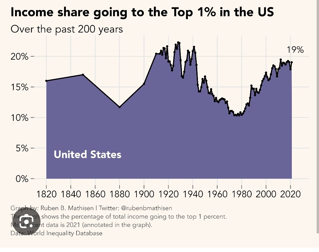
Income share for the top 1% has nearly doubled in the last 50 years.
This is not how income inequality is typically reported as a general stat, and looks stable for the past 20 years in the chart you provide. It didn’t suddenly go up under Biden.
Turns out that voters don’t think the economy is bad because of inflation, wealth inequality, etc.
They’re just morons
https://x.com/carlquintanilla/status/1793262110547349509?s=46&t=N0_fcOKIYYmlCS2e4YShsQ
I actually think this is all from inflation. They are mad about prices and all the negative sentiment on every aspect of the economy stems from that. Kitchen table politics is always about feelings, not metrics.
They have no idea what inflation is. Concerns about inflation have actually gone up in the past three months, despite it cooling significantly.
People are repeating what they see in our media, and our media is shit
Oh and wages > inflation, seems like that should be important
My whole point is that inflation makes people angry beyond all reason, it doesn’t matter how much their wages grow or what the employment rate is or what the stock market is doing. Their lives can be objectively better in every way and the subjective experience of sticker shock on “normal” purchases makes people irrationally pessimistic about the economy.