DC Data Modeler update:
June 14th COVID Update – How To Understand Confirmed Case Data: A Tale of Three States
Short version – confirmed case data are inconsistent and very hard to interpret on their own. Combining daily confirmed cases with daily tests processed and evaluating against historical death data provide a reasonable way to estimate what’s happening with the spread of the disease.
tl;dr as always, although at a mere 1,000 words for me this is pretty short. 
The news is full of stories about states in which cases are on the rise vs those that are seeing cases fall. Because confirmed case data are highly dependent on the amount and quality of testing, it’s challenging to look at the rising or falling of confirmed cases and understand how to draw inferences directly. Percentage of tests that are positive are similarly challenging to interpret because not only do they depend on the number of tests but also the quality of the tests in use. Some jurisdictions use a mix of tests, and some change them over time.
Hospitalizations would be a better indicator of virus activity in theory, but unfortunately jurisdictions report inconsistently and with fundamentally dissimilar statistics. Some report current hospital/ICU admissions, some report cumulative hospitalizations/ICU admissions and some report both. A few provide neither. As a consequence, there is no reasonable national data set to provide US hospitalization data or comparable data across the various jurisdictions.
Before an increase in deaths is observable in the data (the most accurate indicator available), the best option to understand whether an increase in COVID-19 infections is underway is to compare within the same jurisdiction the change in the daily number of processed tests to the change in the daily number of confirmed cases. If testing is constant and confirmed cases is rising, that is suggestive of a potential increase in the number of COVID-19 infections in the area. That’s not the only possible interpretation, however. It is also possible that there is a limit on the number of tests in a jurisdiction, and that as the demand for testing increases, the tests are being reserved for individuals more likely to be sick. As I’ve said in previous updates, it can be very hard to accurately make rational interpretations of testing data much less to make predictions from them. Combining these data with daily death rate help to better interpret which story makes the most sense.
I do get this question A LOT, however, so I’m offering data from three states (Worldometer and JHU data) to provide an approach you can all use to get a reasonable best guess as to what’s happening with disease spread.
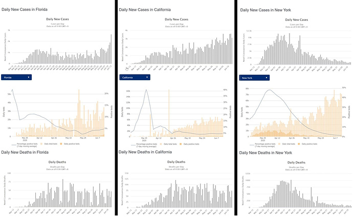
FLORIDA – NEW CASES RISING AND TESTING RELATIVELY CONSTANT
On the data on the left side of the table, you can see that Florida is experiencing a new and sudden increase in daily new cases. The last three days have been progressively larger new records, with yesterday’s cases being about twice the number of daily cases as the worst day recorded prior to last week. Since the peak in reporting in late May, the number of daily tests has been relatively constant over the last two or three weeks, it is reasonable to assume that we are in the beginning phase of a new exponential outbreak. Because we are seeing the meaningful spike in new cases after a generally constant number of daily new cases for the last six weeks, we would NOT call this a second wave, but rather this is a substantial worsening of the existing wave. In statistics we might call this a step function. The death rate has also been relatively constant for the last week, again suggesting that the number of daily new cases in the prior timeframe had been stable. If these new data points over the last week do in fact represent a new rise in cases, we should expect to see daily deaths start to spike in the next 1-2 weeks. If you think back to the June 7th update, the timing is entirely consistent with relaxation of restrictions and Memorial Day shenanigans.
CALIFORNIA – NEW CASES RISING AND TESTING RISING
The middle tables in the attached image relate to the situation in California. Compared to Florida, California was impacted earlier and took substantially faster action in attempts to mitigate the pandemic. Additionally, California has been much slower to reduce those mitigation efforts. While the number of daily new cases has risen in a nearly linear fashion over time, the amount of testing has risen at about the same rate. This suggests that either the actual rate of transmission in California is basically constant and they are simply finding more of them due to testing, or the rate of transmission is increasing and testing has increased due to demand. Because the daily number of deaths has been essentially constant over the last six weeks, it is most likely the case that the former is true and the rate of transmission is stable.
NEW YORK – NEW CASES FALLING AND TESTING RISING
New York was, by far, the hardest hit in the United States and among the hardest hit anywhere in the world (so far). As a result, they responded with one of the most complete lockdowns in the US, and have only in the last few days begun to move to relaxing restrictions in New York City. In the case of New York, the number of daily cases have fallen precipitously as a result as have the number of daily deaths. During that same period, the number of COVID tests being processed daily has dramatically increased. In this case, it is clear that they have taken control of the initial wave of the disease although they have as yet been unable to eradicate it.
Nationally, the number of COVID tests being processed has been rising over time, the number of confirmed cases fell somewhat after the peak but has been relatively steady for the last five weeks, and the number of daily deaths has been failing for essentially the same time period. What the discussion above (hopefully) shines a light on is that it’s vital to look at these data regionally in order to understand the direction of the disease. New York and California combine to consume about one-fifth of the US population, so what’s happening in those states drives a great deal of the national data.
Hope this helps you all as you try to interpret what’s happening before we start seeing the potential changes in daily death numbers. Let me know in the comments if you have any additional questions, I’ll try to answer them all.
I’ll follow up on June 17th a new update that discusses the precision of my model as it reaches one month of age, and how to estimate the number of lives lost from the early openings, unsafe partying, and mass protests.
Thanks for reading this far and thanks for all the shares! I’m humbled and grateful that my obsessive desire to understand what the hell is happening may be helping others. As always, don’t forget that I’m not an epidemiologist or medical professional, just a guy that’s pretty good with math. If what I’m saying contradicts what you’re hearing from smarter, better trained people than me, Dr. Fauci for example, believe them and not me. Seriously.
Stay safe, be smart, and wear a mask.


