Note #1: if we have graphic design people or marketing people lurking about, please join the process, give feedback, draw something neat. Or link to some media/politicking branding that you like (or hate).
Note #2: In this poll (poll #1) you are voting for the “direction” of the graphics and branding, if there were to be some overwhelming preference for an abstract approach but all these examples suck, that’s still fantastic, that will narrow the task a lot.
At any rate, here are some options.
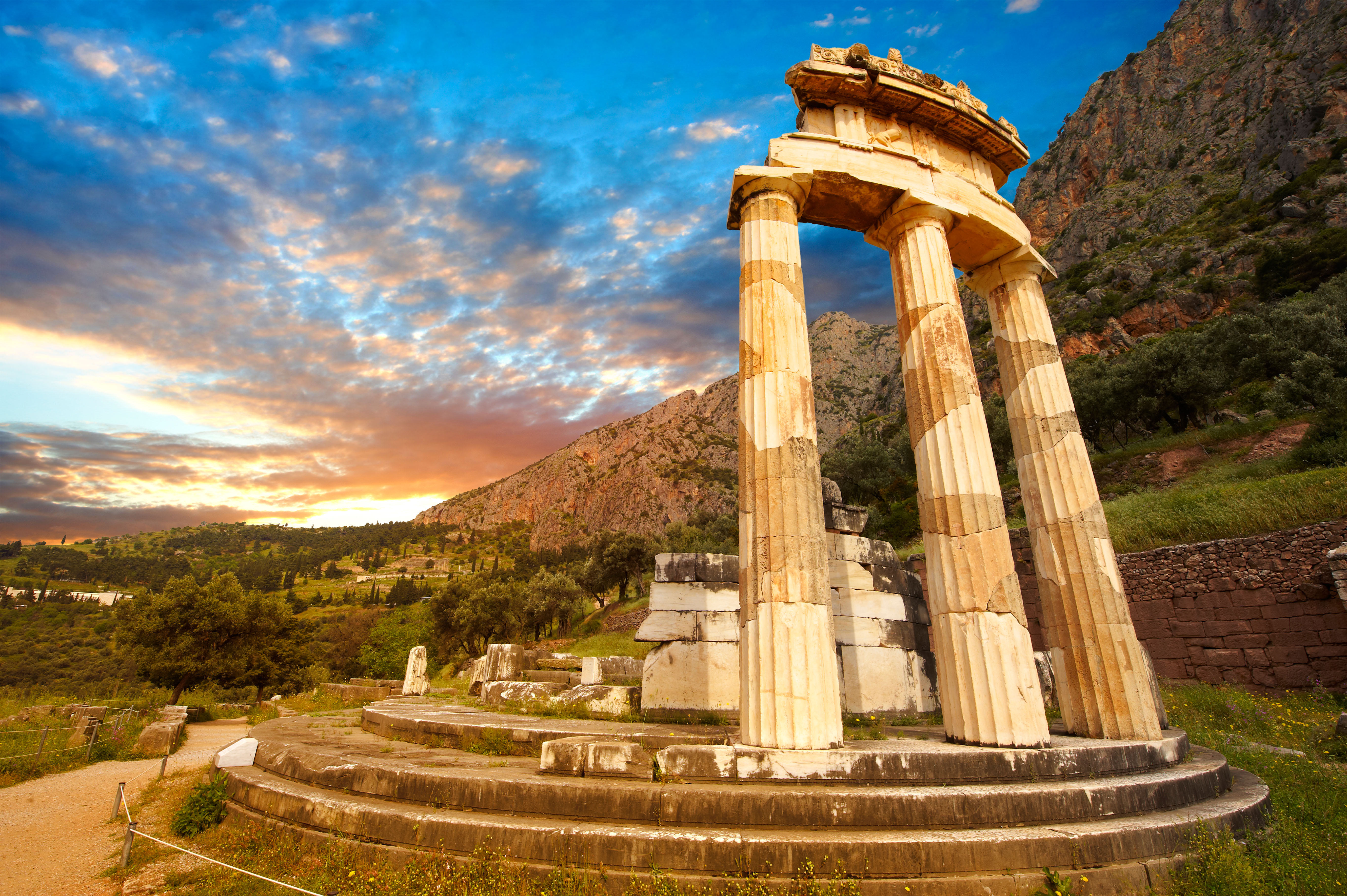
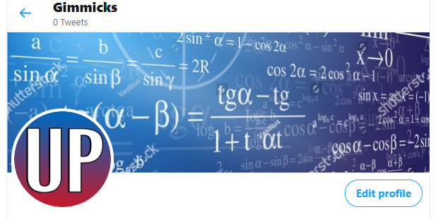
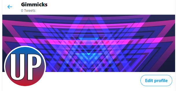
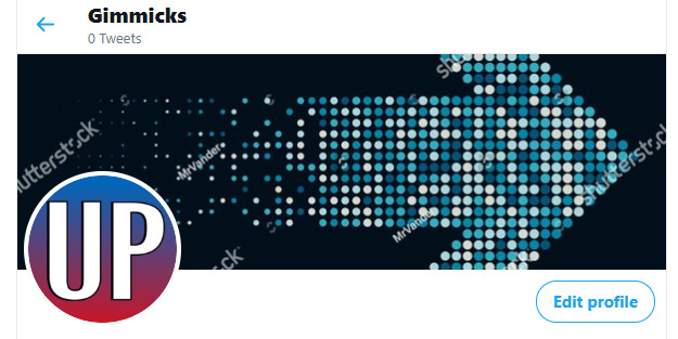
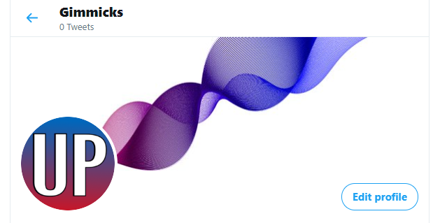
[color=cyan]OPTION 1[/color]: Abstract design, no direct political leaning implied, could make use of mathy stuff or probability stuff.
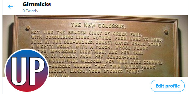
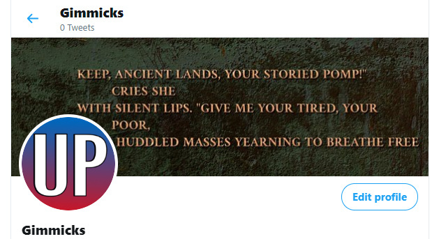
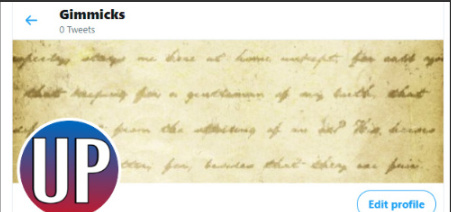
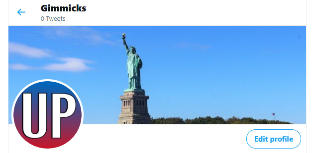
[color=#00FF00]OPTION 2[/color]: Something that incorporates the poem “New Colossus” (Statue of Liberty poem), or possibly some other text:
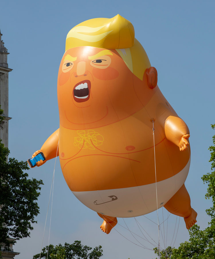
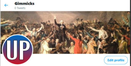
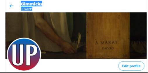
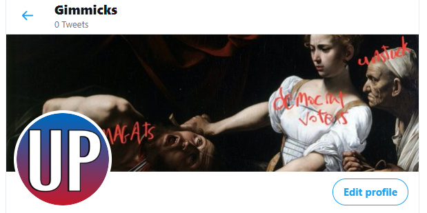
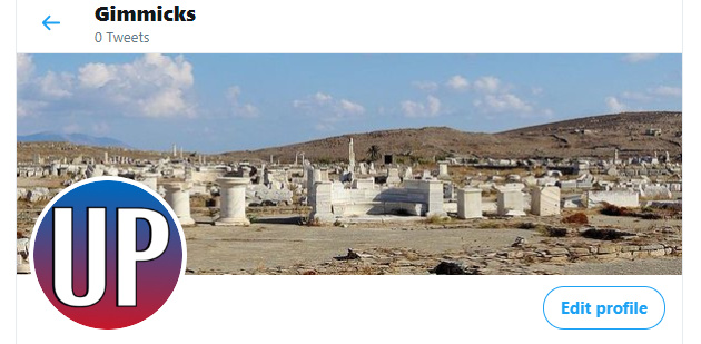
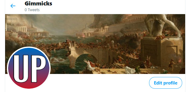
[color=#FFAAAA]OPTION 3[/color]: Some painting that we like that subtly or not so subtly says something about the community, can also include photographs
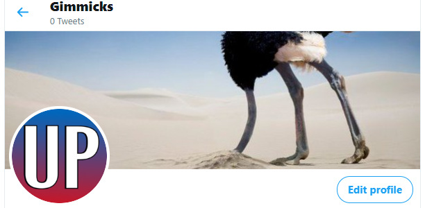
[color=#FFAA00]OPTION 4[/color]: Something funny that communicates unstuck in a different way, it’s probably beyond my skillset to make I could see something like a row of ostriches with their head in the sand and then one unstuck ostrich
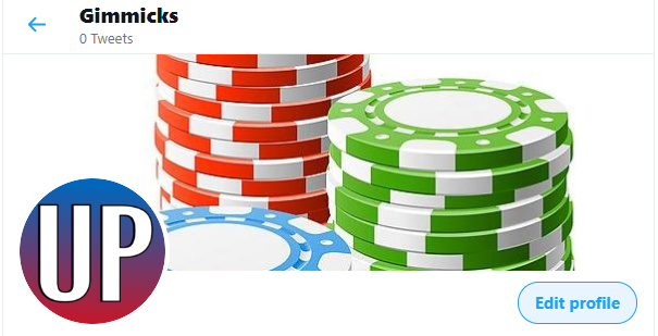
[color=#00AAFF]OPTION 5[/color]: Lean into the poker angle, chip stack, cards, etc.
[color=#FF))00]OPTION 6:[/color] All of this kind of sucks, I have a better idea (if so, please say what it is)
I’m giving out 2 votes per person but use only 1 if there’s only 1 that you want
- [color=cyan]OPTION 1[/color]: Abstract design, no direct political leaning implied
- [color=#00FF00]OPTION 2[/color]: Something that incorporates the poem “New Colossus”
- [color=#FFAAAA]OPTION 3[/color]: Some painting or photograph that we like
- [color=#FFAA00]OPTION 4[/color]: Something funny that communicates unstuck in a different way
- [color=#00AAFF]OPTION 5[/color]: Lean into the poker angle, chip stack, cards, etc.
- [color=#FF0000]OPTION 6:[/color] All of this kind of sucks, I have a better idea
0 voters