COVID-19: Chapter 4 - OPEN FOR BUSINESS

I’m reading a book related to this topic. Essentially (re)understanding evolution as an immunological event/process. (I am not a scientist so pardon if my one sentence synopsis isn’t perfect)

The Microcosm Within: Evolution and Extinction in the Hologenome. By William Miller

2 Likes

Is the United States of America a first world country?

  • Yes
  • No

0 voters

Good news!

:rofl:

I voted No, but we’re not second world (socialist), and we’re not third world or worse. We’re like some new class of rich, but democratically flawed and societally instable nation. We’re… USA#1.

Is any other 1st world country fucking up this badly? Even the UK is showing a recovery instead of a plateau like the US.

1 Like

There are a lot of people on here compiling data and doing analysis, so I’ll join the fray with another perspective. Based on the types of data people on here are collecting, it might be worth it to create a dumping site on google sheets. I’m fairly sure I’m the only one doing the type of analysis I’ll describe below, and I can make all of my data available to people on here to do their own analysis of it, if interested.

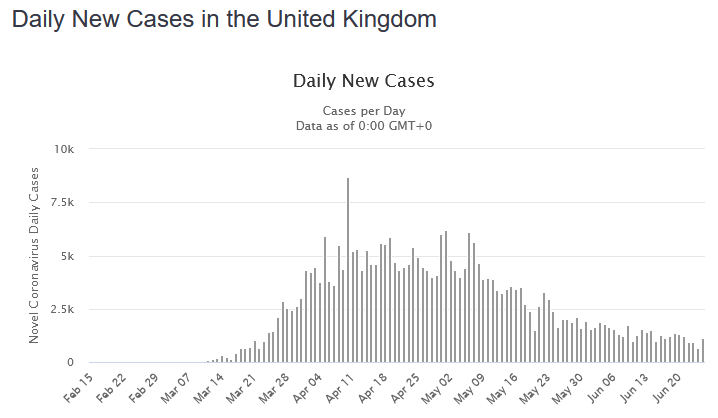
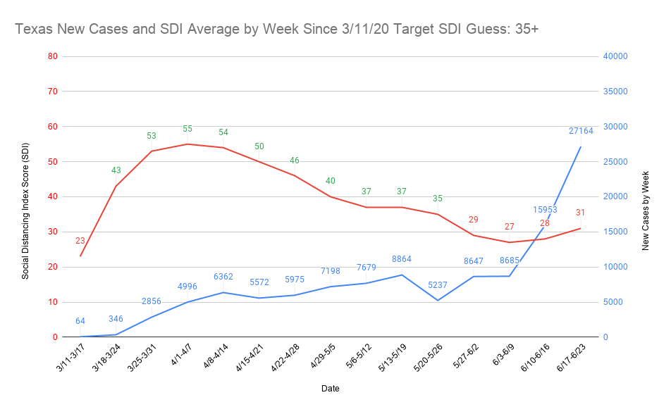
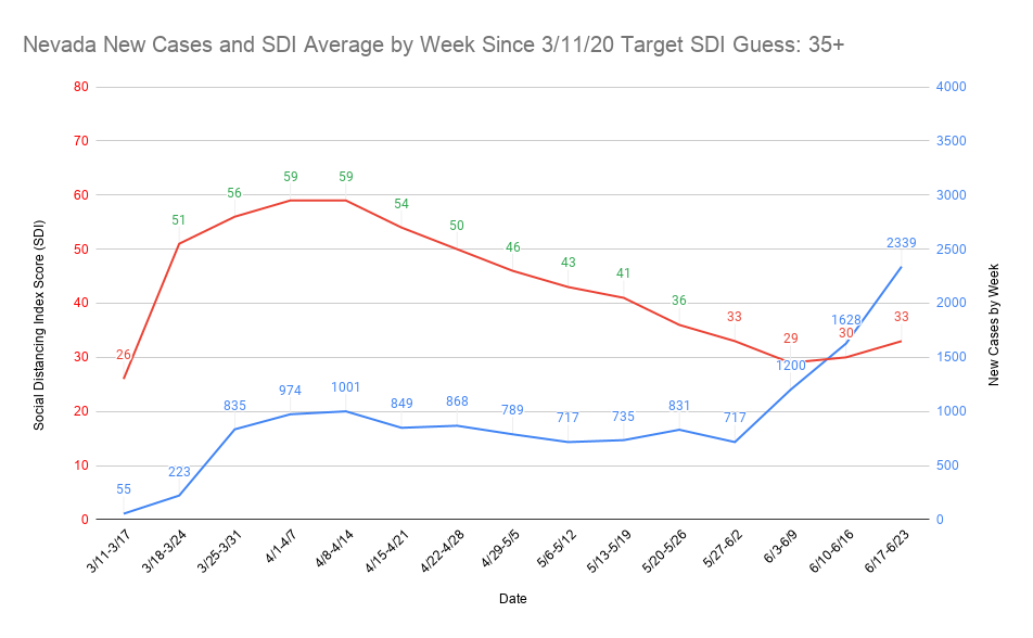
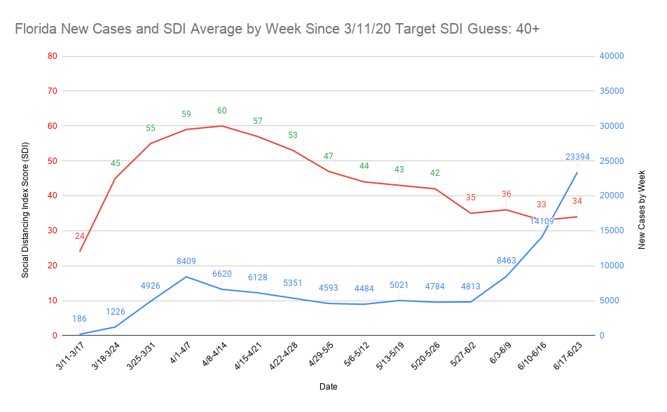
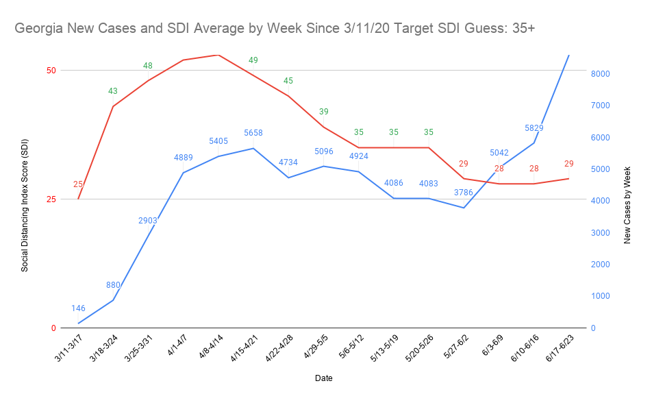
One of the things I’ve seen asked quite a few times on here is why Florida, Texas, and Georgia managed to escape really bad numbers at the beginning of the pandemic, despite having absolute idiots as governors. As Dan can probably attest, I felt like I had ‘discovered’ the answer in something called the Social Distancing Index score (SDI) that is being tracked at https://data.covid.umd.edu/

In all three of those places, based on SDI performance, the people listened to the health experts and ignored their terrible governors. Even though all three of them issued statewide orders horrifically late, people in their states had basically voluntarily locked down significantly ahead of the governors. The problem is when it came to re-opening, many appeared to listen to Trump and their dumb governors over the health experts. That’s created the reckoning we’re facing and I believe the SDI numbers bear that out.

The only real problem with the data (and there is a lot of it that’s useful on that site) is that it tends to lag 2-5 days depending on the day of the week. It also has to be grabbed manually instead of off a spreadsheet like covidtracking. As of right now, it’s only updated to June 22. The good thing about that lag is that it’s not meaningful anymore due to the relatively widespread re-openings. They’ve all been going on long enough that it’s fairly easy to tell the cat’s out of the bag and is going to be exceptionally difficult to get back in.

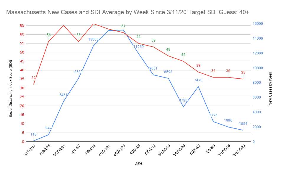
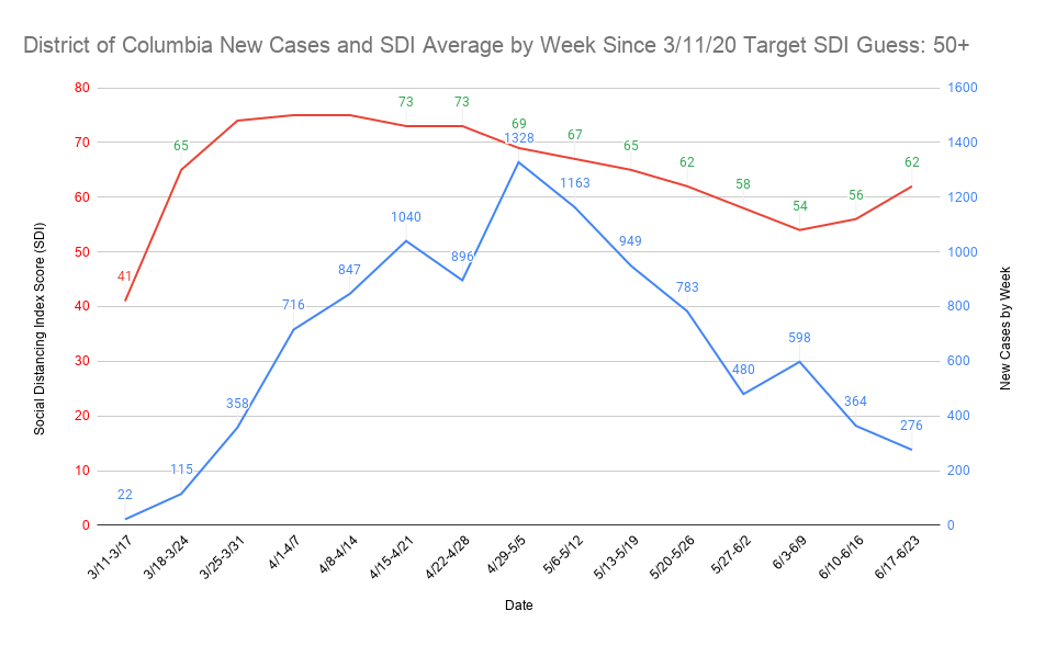
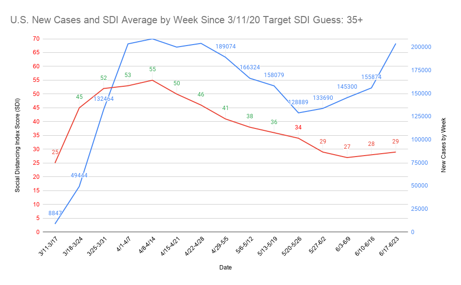
I’m not generally interested in the prediction side of this, but have been very interested in trends to see what’s appearing to be working and what isn’t. Every time, I come back to the SDI. I feel like nearly everything going on right now could be analyzed at three levels and probably get pretty close with trend modeling. Those three pieces are new cases, SDI, and R0. I don’t know how they interact with each other in a way that can make a formula, but SDI and R0 are very likely creating conditions in some of the best performing places that in some ways don’t seem to make sense (Rhode Island, Delaware, Connecticut, Massachusetts, and Michigan).

I don’t have time to drop all the graphs on here right now, but one of the things I was trying to accomplish was graphing the correlation between SDI and case rise and/or fall. It previously had been nearly impossible in my skill set due to the small SDI numbers and large case numbers. Dan showed me a graph a few weeks ago that demonstrated the look I was going for but was far too noisy with too much data to be useful. When I saw some of goofy’s graphs, I knew it was possible to make something that would work. I reached out to a friend and with trial and error we figured out both the graph type and what kind of data it needed to have in it to show the effect I was looking for.

I’ve been compiling daily SDI since March 11 for 51 places and had always found behavior was making the data too messy to be super useful. The lowest SDI always consistently occurred on Mon-Thu. Fridays always had the single worst day SDI, but it didn’t fall apart everywhere all at once. Sometimes places would ‘cheat’ on a Friday but get back to good SDI every other day of the week (at the daily level, I think this was why Illinois continued to grow in cases despite having high weekly average SDI). Uniformly, throughout the country, SDI was high on the weekends. I built what I felt were reasonable SDI guesses of case surges in nearly 20 places, many of which ultimately seemed to be correct or within a day.

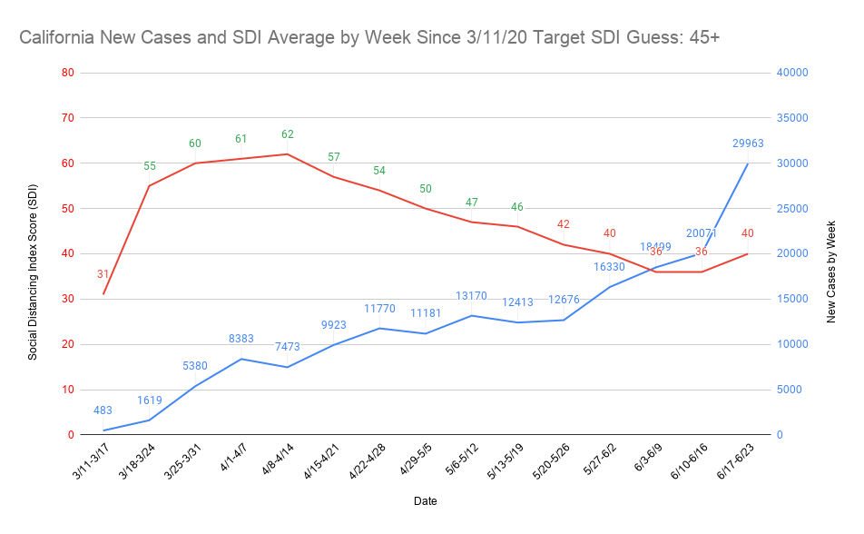
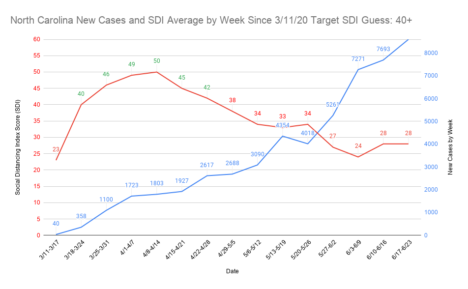
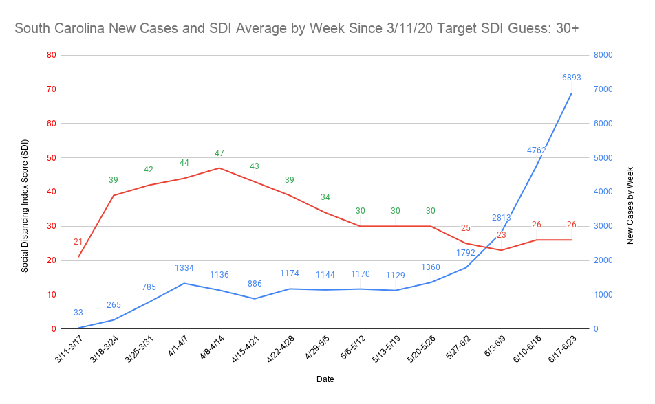
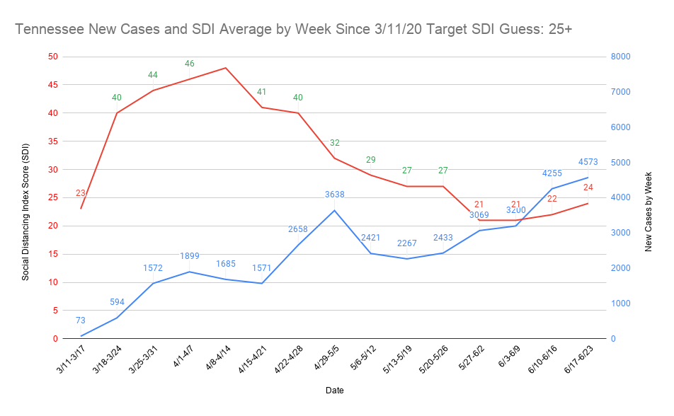
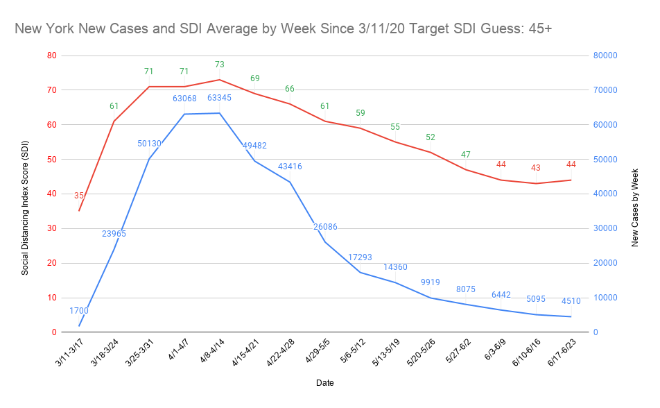
When coming up with the graphs yesterday, I realized this level of detail was likely a mistake, and went back to the weekly SDI average. In every case I’ve looked at so far of the roughly 12 highest caseloads right now, I think the generalized SDI (localities have wildly different SDI as a data point) gave me the results I most expect to see. 14 days after falling below what I perceive to be the target SDI, I see the surge in cases beginning. In a place like NY, the ‘surge’ is a slowing of the drop. I haven’t done a thorough analysis of the graphs yet, so will need a bit more time to make some guesses about what might happen.

That said, as much as I hate to say it, I think many of the biggest hot spot places are essentially ‘done’ until a vaccine. In the best performing places that are high density population, it seems pretty clear to me that it takes at least 10-12 weeks above the target SDI to not get a nearly ‘immediate’ big rise in new cases once the place has fallen below their target SDI. In a place like NY it might take 14 weeks above the target SDI, which is similar to what I think has happened. I don’t think there are any places that have had any significant amount of cases that can fall below their target SDI in fewer than 8 weeks and still have any degree of success. At this point, we’re now over 4 weeks removed from Memorial Day weekend, the weekend nearly every place in the country first dropped below their target SDI. I doubt a single place that’s dropped below its target SDI is back above it as of the 6/17-6/23 measurement period (a few are inching back up toward it).

By looking at some of the hardest hit places early in the pandemic, it took about 4 weeks of being significantly above the target SDI just to begin slowing it down. That was with only one week of time below the target SDI as spread began. We’re at four weeks now, minimum, almost everywhere and almost every place in the country has more active cases now than when that last week of poor SDI happened (3/11-3/17). If it took 10-12 weeks to start flattening the curve after only one week of bad SDI in hard hit places, I can’t even imagine how many weeks it will take to get back to that flattening after this failed re-opening experiment. My preliminary guess is January, if we get back above target SDI in most places right now (it will probably be at least another week before that happens), but I really hope I’m wrong.

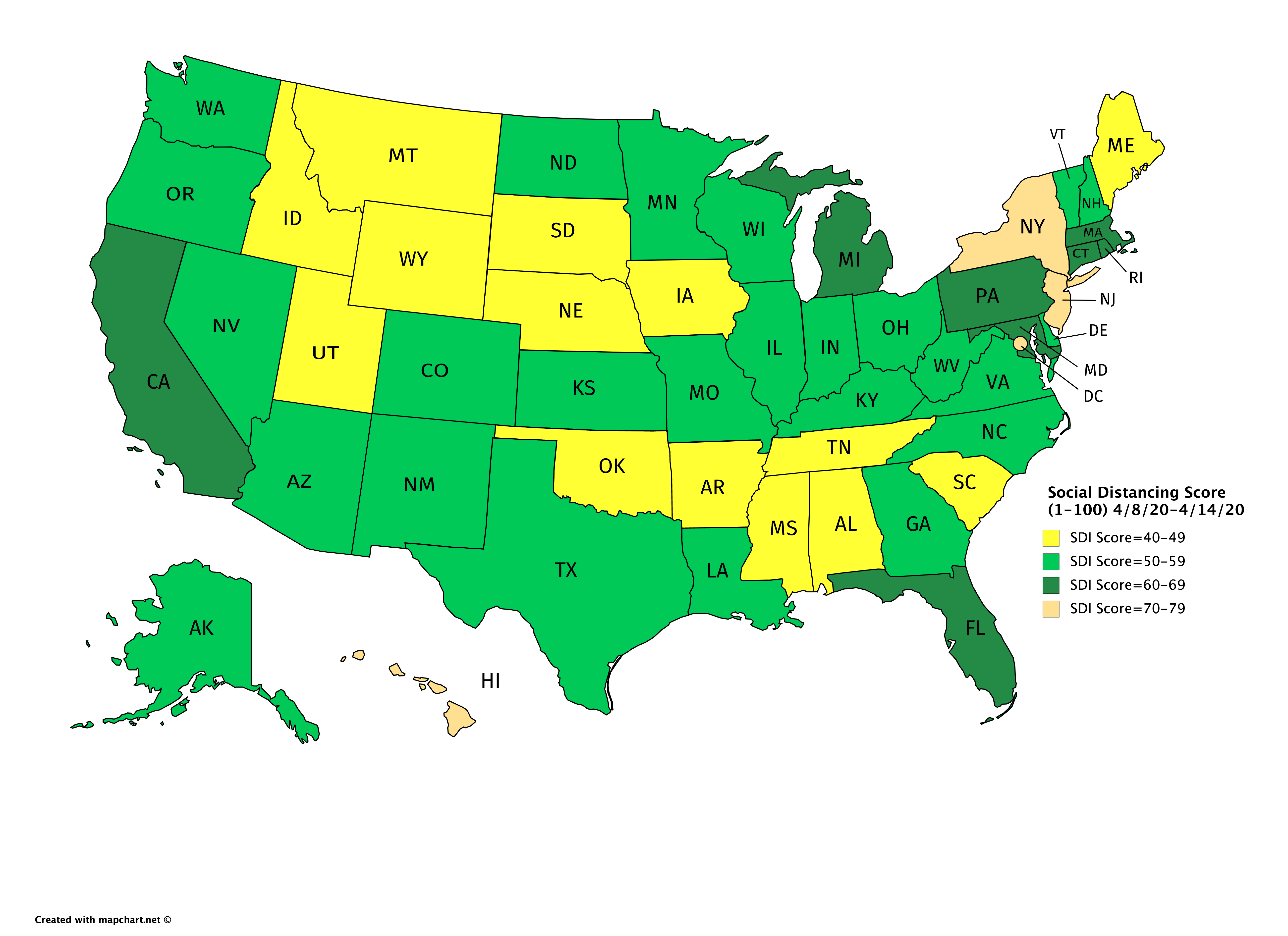
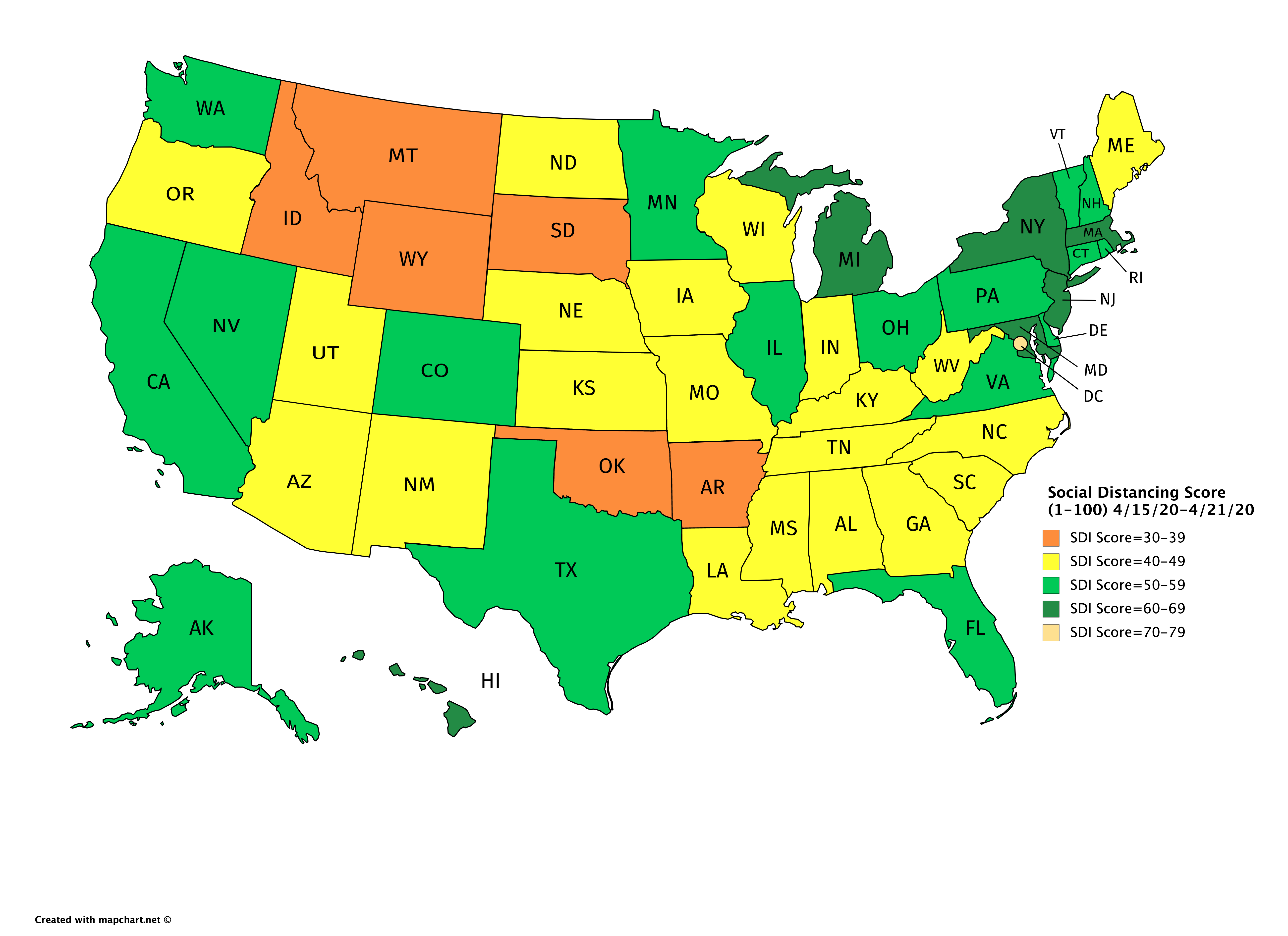
To close out this post, I want to show the effect of the asshole Trump without getting into the specifics of how many people he’s straight murdered in the pandemic. My original perception of the target SDI for the country to begin having success as a whole was 40+ SDI. It took nearly a month to get there, but the country did it. Every single state was above 40 SDI. The next week Dumb Donny started being a crybaby about opening up and liberating stuff. There has not been a single instance of every state in the country having 40+ SDI since. These two maps show that immediate effect:

SDI Map 4/8-4/14:

This is what the map looked like the following week.

SDI Map 4/15-4/21:

Now that the basic methodology has been explained, I’ll make one more post with 12 graphs in it without much text. Most of the graphs are the worst current weekly caseloads or trends, but there are a few also in there to demonstrate what good SDI work looks like (in my opinion, if overall SDI remains high and active cases relatively low, protests would not have had a big effect on new cases especially with good masking practices). I’ll eventually post all 51 (SDI isn’t tracked in Puerto Rico), but it’s unlikely that will happen until tomorrow.

18 Likes

The total number of individuals tested yesterday statewide was 6,969 (not including antibody tests) and the percent positive was 18.3%.

SC numbers are in and they’re bad. New record high, but just barely. Hospitalizations up, but at a lower clip than we’ve seen.

The number of tests seems to be at capacity and it seems to me like we aren’t going to be able to even measure further spread. We have seen positive percent go from 3% to 18% but not a substantial increase in testing to go along with it. What that tells me is that there’s going to be a cap on how many cases S.C. can measure and report per area, which means this could be more prevalent than we expect.

The silver lining is that hospitalizations are increasing slowly still and there are more than two open beds for each reported hospitalization in the state which gives us time to get things under control

Testing is obviously maxed in all the hard hit states. Florida has stories about people waiting in line for hours and hours starting at 1am. When the experts said we needed 20m tests a day capacity maybe we should have listened. It is obvious 500k tests/day nationwide has no chance of being adequate and yet Trump and the goon squad are currently cutting funding for testing sites.

1 Like

It’s quite an awesome idea to tie in some many factors but at the heart of it, some weighted score of peoples behavior plus some inter-area transmission by travel and density should be able to describe a transmission model that fits the observed spread.

Many things may serve as proxies like cell phone mobility and nun’s SDI term.

With all this stuff the score keeping is always lagging and everything has some average offset to everything else. That’s the tricky part imo.

Bravo

3 Likes

Are you able to split states into regions and/or do it for locales? Like could you look at Houston vs. Dallas, Orlando vs. Miami, etc?

Can we start over and be friends? Good post and I think you are on track even if we disagree about how useful a Jerry Nadler is.

6 Likes

Here are 12 Social Distancing Index score (SDI) average by week and new cases by week graphs tracked since the pandemic was officially declared on March 11. The graphs are current through June 23, and things have obviously gotten much worse since then. In the graph title is what I perceive to be the target SDI a place needs to be above to begin slowing the spread of cases (R0 is not factored in here). It is a guess, but I think an educated one. On the left side is the SDI weekly average, and on the right is the weekly new cases. I made ‘good’ SDI green at each data point, and it’s red anytime it’s below the target SDI. I think you begin to see the rise trend around 14 days after the place falls below the target SDI.

4 Likes

I know you’re trying to put a positive spin on this, but keep in mind that the average time from infection to hospitalization is around 12 days. The average time to symptoms is around 5.7. So there’s ~a week between symptoms (testing) and hospitalization.

Official case numbers from 12 days ago to now:
840
583
612
561
982
1075
1148
905
1005
906
1270
1120
1275 (based on .183 * 6969)

Anyway, my point is you’re probably seeing hospitalizations from the bolded reflected in daily updates now. Expect hospitalizations per day to be relatively flat for the next several days, but discharges are still going to be based on cases that came in when there were 150-300 cases per day being registered. So the hospitals are going to start to take in more and more cases.

1 Like

That’s pretty awesome. So what is SDI, how is it calculated and where do you get it? I assume the target guess is based on factors such as population density, public transit usage, and climate?

It’s hard to categorize a decaying empire

6 Likes

We are halfway between rotting and decomposed at this point.

1 Like

I have this data for a number of hot spot counties that I started tracking about 6 weeks or so ago and can now easily graph it out (it would just be comparing two graphs, not on the same graph). SDI only goes down to the county level, so that’s the deepest you’ll be able to get. I wasn’t tracking Orange County, FL, so I think that would be a good one to use for this based on their explosion. The one caveat is the new case data at UMD might be lower than it would be reported in other places, but I’ll be using it due to the county level usefulness.

What you’ll notice when you see these graphs is that places like Dallas County have extremely high SDI as does Miami-Dade. A good hot spot I caught was Palm Beach County (have a friend who lives there so I was curious as to how it was doing). They had extremely high SDI, but right after Memorial Day weekend it was all over and they were hit like a Mack truck. Santa Clara County was having a similar but slower outcome when I was tracking it (I think I’m about two weeks behind on the county level graphs right now). As goofy said Santa Clara was GOAT at SDI and keeping cases down for a long time, but that appears to be over unless there’s been good news since I last tracked it. D.C. is doing an amazing job with SDI which I think is why the most densely populated place in the country has a vanishingly small amount of cases.

I assume this is the SDI that nun is using. The metrics are being calculated by the Maryland Transportation Institute “based on validated computational algorithms and privacy-protected data from mobile devices, government agencies, healthcare system, and other sources.”

The social distancing index is computed from six mobility metrics by this equation: social distancing index = 0.8*[% staying home + 0.01*(100 - %staying home)(0.1% reduction of all trips compared to pre-COVID-19 benchmark + 0.2*% reduction of work trips + 0.4*% reduction of non-work trips + 0.3*% reduction of travel distance)] + 0.2*% reduction of out-of-county trips. The weights are chosen based on share of residents and visitor trips (e.g., about 20% of all trips are out-of-county trips, which led to the selection of a weight of 0.8 for resident trips and 0.2 for out-of-county trips); what trips are considered more essential (e.g., work trips more essential than non-work trips); and the principle that higher social distancing index scores should correspond to fewer chances for close-distance human interactions and virus transmissions.

1 Like

SDI is the Social Distancing Index score, and it’s at this site (it’s calculation is explained there): https://data.covid.umd.edu/

When I originally tracked SDI, I was just looking for some kind of settling. I thought 40+ SDI would make a difference (similar to how I felt 200 new cases in a day was the flashpoint for a state exploding). Population density plays a huge part in what I think the SDI target needs to be. I started trying to find the trends about 2.5 months ago, but told Dan a couple of weeks ago that I thought my data wouldn’t become useful until about 3 or 4 weeks later for doing real predictions due to it being the first time places had fallen below the target SDI. It looks like it’s happening earlier than expected due to case explosion.

Around here there’s been a lot of speculation about temperature, density, etc. and how it factors in but I still have yet to find anything that seems to explain it better than SDI and governmental response (R0 is for sure playing a factor where SDI effects and/or testing aren’t making sense). Good governmental response and good SDI is the winning combination. Good SDI can mitigate bad governmental response. Nowhere had both bad governmental response and bad SDI other than maybe Arkansas. I think the pandemic is defying every single expectation of how experts believe coronaviruses behave.

There are two other variables I ultimately want to include as actual data points, which are humidity average and population density. Why is Rhode Island killing it? It makes no sense to me other than their massively high testing early on. Same with Delaware (had a great early response) that’s surrounded by hot spots. One would think COVID-19 would do well in cold places, but almost all those places are doing the best (this gets broken with Idaho). The problem is all those places get very hot in the summer which means they might just be lagging.

Everything I’m doing is just guessing based on visualizing trends, but it’s seemed to be fairly close so far in any place that blows up. The graphs are the first time I was able to see it how I wanted without just looking at raw numbers.

Lester Holt MIA from NBC Nightly News.

Probably on vacation but I’ll bet he has COVID.