The issue with poker is that it’s kind of a vestigial tail over on 2p2… so there’s less than zero reason to retain that identity going forward.
Obvious solution is to use a photo of an abstract painting.
No new voters today, I won’t close the poll but I think it’s fair enough to move on and decide between the top two options.
Slightly better cropping imo, more column, more horizon, but cuts off the top a bit. I think there are 2-3 votes for this specific one already. I guess what I will do next is put up a bunch of individual ones and use the 1-10 polling thing for each.
Obv
I honestly think that’s a good image to use.
I don’t want to start too many threads, I’m just going to start linking some stuff with polls under them. Replacing UP circle image with a blank to avoid bias. 1 to 7 hate it => love it.
Starting off with Caravaggio - The Cardsharps. I know we said no poker but I couldn’t resist.
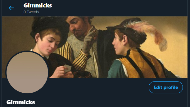
- 1
- 2
- 3
- 4
- 5
- 6
- 7
Le Serment du Jeu de paume by David: Group of reasonably well off white dudes vowing “not to separate, and to reassemble wherever circumstances require, until the constitution of the kingdom is established” after the king (maybe? though probably not) locked them out of a meeting hall, kinda fits.
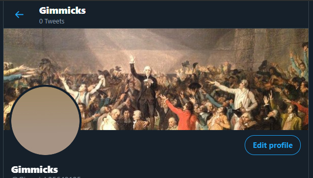
- 1
- 2
- 3
- 4
- 5
- 6
- 7
The Course of Empire is a series of five paintings created by Thomas Cole in the years 1833–1836. Cool stuff, I can probably do some effect linking them better, like a zigzag line so they cut into each other.
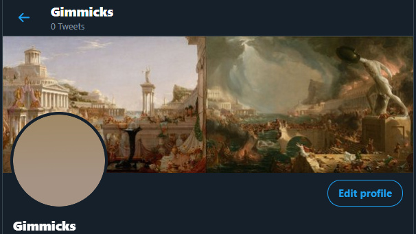
- 1
- 2
- 3
- 4
- 5
- 6
- 7
Lastly for now, The Death of Marat by David. I guess this community is Marat, the friend of the people, and Madame de Condorcet is the reactionary who killed it, make your own connection? Perfect trolling opportunity on the wooden block.
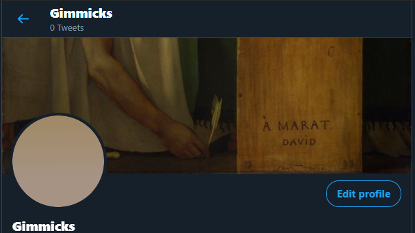
- 1
- 2
- 3
- 4
- 5
- 6
- 7
TBH, @beetlejuice already won this genre with
But I’m going with that’s a touch too provocative.
maybe this
maybe not
I’m liking Death Of Marat
And if you need a long ass rectangle with topical substance you can’t go wrong with Guernica.
I don’t think we can use Guernica, it’s not in the public domain, even if it were like the kandinsky ones you linked, those are museum pics with a copyright (I think), correct me if I’m wrong
But my Soul wanders; I demand it back
To meditate amongst decay, and stand
A ruin amidst ruins…
For any of these photos, I can crop them differently, play with the color levels, remove any people, run them through some filters for different effets, etc…
- 1
- 2
- 3
- 4
- 5
- 6
- 7
0 voters
- 1
- 2
- 3
- 4
- 5
- 6
- 7
0 voters
- 1
- 2
- 3
- 4
- 5
- 6
- 7
0 voters
- 1
- 2
- 3
- 4
- 5
- 6
- 7
0 voters
- 1
- 2
- 3
- 4
- 5
- 6
- 7
0 voters
If you have art or pics that you want voted on, just throw em in and build a poll
Brings up this modal window, insert poll at bottom
Probably most of these are copyrighted and/or stock photos that can probably be purchased fairly cheaply, but I’m looking at them for either composition, scale, or styling.
1 (probably won’t fit in right on the canvas you have):
2:
3:
4 (same issue as 1):
5:
6:
7:
7’s probably my favorite, but I can’t tell what the copyright on it is, and it doesn’t appear to be a stock photo.
Of the ones smrk posted, I still like the column with the blue sky one the best.
I think the art still tilts a little esoteric.
Here are some more ideas, most might not be available:
1:
2:
3:
4:
5:
6:
7:
8:
9:
10:
11:
12:
https://timedotcom.files.wordpress.com/2019/02/greece-super-snow-moon.jpg
I think a pic of ruins only works if it’s a forum or agora. Temples don’t really make sense.
I actually don’t know what the structures are, but I agree.
The ones immediately above are the Temple of Poseidon. Number 7 further up that you liked is the forum of Rome.
Oh, I thought most of the photos were from Greece. I’m going to look up some different ones, and see what I find.